

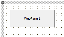
Welcome to TMS WEB Core. TMS WEB Core is the foundation of an exciting new and modern way for creating web client applications from Delphi using RAD development methodology and using a component-based framework.
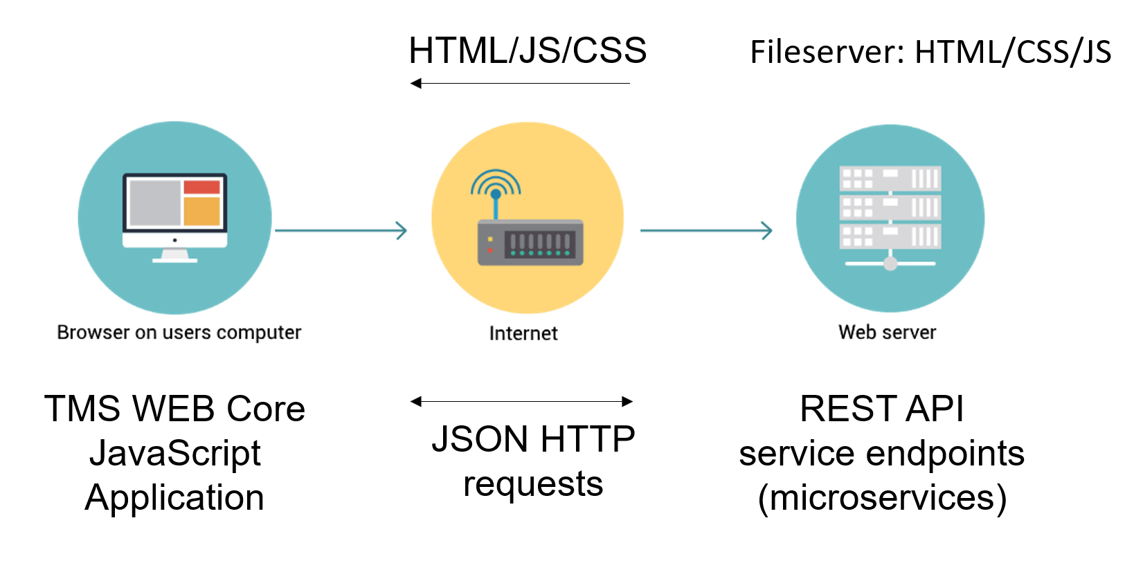
TMS WEB Core is based on compiling Delphi UI code to JavaScript and creating this way what is called Single-Page-Applications. The terminology “page” should not be confused with forms that Delphi developers are used to. A TMS WEB Core application can contain multiple forms. These multiple forms will be hosted in a JavaScript application a web browser user can navigate to via a single page URL. We will further refer to TMS WEB Core applications as web client applications. This means applications running as JavaScript code in the browser client (left). The web client application will typically communicate with a server or servers for working with data or other services (right). The TMS WEB Core web client application is open to work with different server technologies. This includes but is not limited to TMS XData, Embarcadero RAD Server, node.js, ASP.NET Core microservices. The typical technology used for this communication is via HTTP REST APIs.
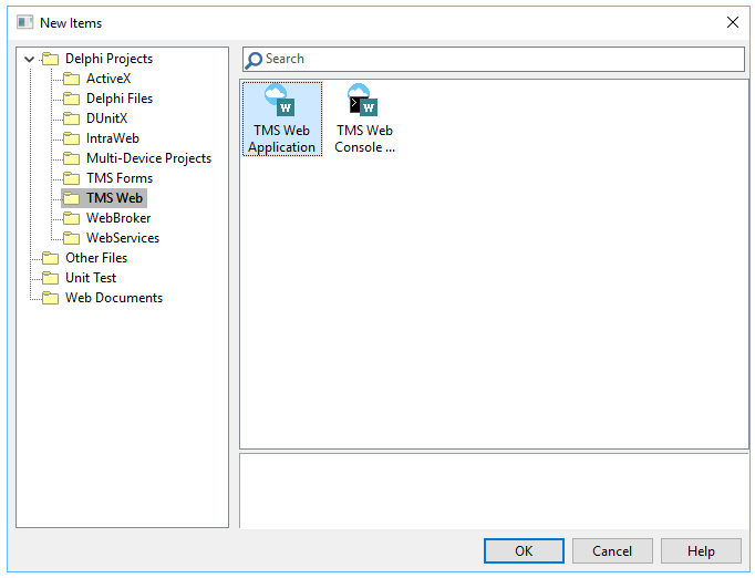
From the Delphi IDE, choose File, New, Other and pick from the wizard either a TMS Web Application or TMS Web Console application:
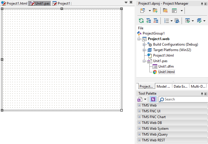
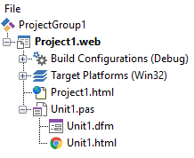
When you created a new project, it is shown in the project manager:

The project consists of a project source file and one or more form files similar to how VCL Windows applications and FMX cross platform applications work. Other than the project source file (.DPR file), there is a project HTML file. This HTML file contains the body HTML for your application and this can include references to CSS and/or JavaScript files. For each form, there is a .PAS file, a .DFM file and a .HTML file. The .PAS file contains the user interface logic for the form and its controls. The purpose of the .DFM file is to persist the component settings and the HTML file serves as the HTML container in which the form controls will be hosted or that contains the HTML elements to which the Delphi control class instances will be mapped.
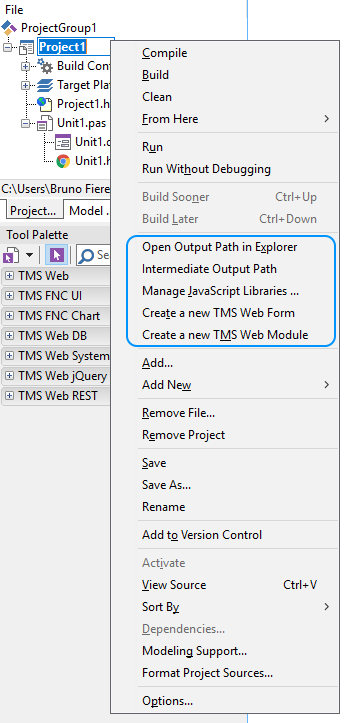
From this context menu, the output path (where HTML, JS, CSS are generated) can be opened via Windows Explorer. It is also possible to add a new web form or data module directly from this context menu and finally, the JavaScript Library Manager can be started. For details about the JavaScript Library Manager, see the paragraph specifically about that.
Technically, a TMS WEB Core application is at design-time in Delphi a VCL Windows application. This is for the technical reason to make use of the Delphi IDE form designer to create the web client application. The TMS WEB Core Delphi IDE plugin takes care to compile the project with all its form files with the pas2js compiler to a JavaScript (.JS) file and deploy it to a web server.
The default project source is:
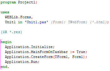
This looks very much the same as a standard VCL application. When the project is compiled to a JavaScript application, it can be automatically launched in the browser from the IDE. This is done via a browser launcher application (TMSWEBRunner.exe) that is configured in the IDE under Tools, Options, TMS Web, Web Runner. By default, the JavaScript application is launched in the browser that is set in the operating system as default browser. If you want to launch the application in a different browser, this can be set at project level via Project, Options, TMS Web, Browser. To get the browser start the web client application, by default TMS WEB Core ships with a lightweight debug webserver and this is configured at install time to operate at port 8000. The web server is specified under Tools, Options, TMS Web, Web Server. See the paragraph on “Configuring TMS WEB Core settings” for more information on how to specify the web server to be used.
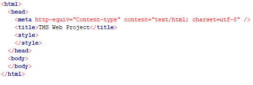
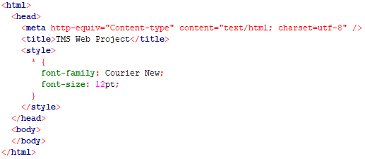
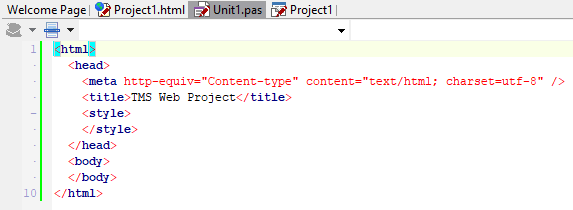
The default project HTML file contains:
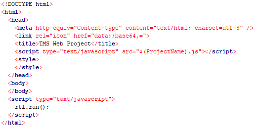
This is a HTML file specifying the HTML5 DOCTYPE. As you can see, by default, there is only one reference in the HTML file and that is to $(ProjectName).js. The TMS WEB Core IDE plugin will in this case compile the application to Project1.js and in the deployed HTML file, this reference will as such be:
From the HTML file, you can see that the application is launched by
When the form file in the web project is open, the IDE tool palette offers all components / controls that have been designed & registered for use with TMS WEB Core:
Just like with VCL applications, drag the controls on the form and add the UI logic code to the form file.
As you can see, with each form file comes a HTML file, unit1.html in this case. This is the HTML container in which the web form will be embedded. This HTML file will be loaded in to the browser document BODY when the web application launches the form. The HTML file can be directly edited from the IDE in its embedded HTML editor but it can also be edited by any web editor or by a separate web designer using his own tools.
This is an empty HTML file. When adding UI controls to the form file, at runtime the HTML elements of which these controls are composed will be dynamically added to the HTML BODY.
The configuration of TMS WEB Core can be found in the Delphi IDE under Tools, Options, TMS WEB:
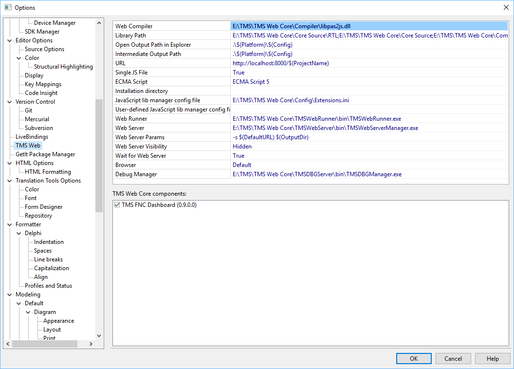
The settings are:
Web Compiler: this points to the location where the Pascal to Javascript compiler (pas2js) is located.
Library path: this is the path the Pascal to Javascript compiler uses. Note that 3rd party controls can separately register paths and this does not affect the general library path.
Open Output path in Explorer: this is the default path the compiler uses to generate the resulting project Javascript (.JS) file. The default is under the project source folder or
URL: this is the URL with which the web application can be launched via the browser. If another web server than the default TMS webserver is used, the URL can be modified here.
Single JS file: Default a single Javascript for the entire web application is generated. If this is turned off, it will be needed to specify each generated .js file reference (for each unit there is a .js file in this case) in the project HTML file.
ECMA Script: This sets the JavaScript standards level for which to generate the compiled application.
Installation directory: this holds the path where TMS WEB Core is installed. Relative to this path, the compiler searches for source files & resources.
Web Runner: this is a the path to the application that is used to start the selected browser for running the web application
Web Server: this is the path where the webserver that is used and that will be launched is located.
Web Server Params: can contain extra command-line parameters to launch the web server
Web Server Visibility: configures whether the web server is hidden when launched or remains visible.
Wait for Web Server: when true, the IDE will wait until the webserver is effectively running before launching the browser to open the web application URL.
Browser: specifies if the preferred browser to launch to debug the web application.
Debug Manager: this specifies the debug tool that is used to communicate between the IDE and the browser. Via this debug manager it is possible to relaunch a web application in the same browser tab when a new version is compiled instead of launching the application in a new browser window or new browser tab.
Under the list of settings, you can find a list of installed 3rd party components for TMS WEB Cor and you can check or uncheck what 3rd party component paths will be used to compile the web client application.
From the project context menu in the IDE project manager, a new pane is added to configure the options of the TMS WEB Core application:
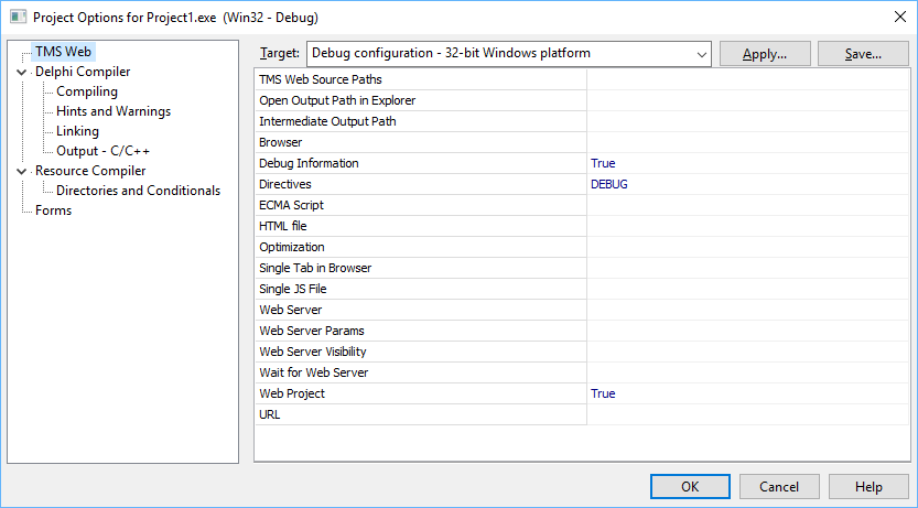
This contains the project specific settings. By default, the TMS WEB Core general settings defined in the IDE are applied when a new project is created.
TMS Web Source Paths: optional project specific source library paths.
Open Output Path in Explorer: optional custom output path. When nothing is specified, the default output path is the folder TMSWebor TMSWebunder the project source folder
Browser: sets the browser to launch to run the application. When nothing is specified, this is the default operating system browser.
Debug Information: when true, the JavaScript debug map file is generated. This option is set by default for the Debug mode of the application.
Directives: Sets the compiler directives to use for compiling the application
ECMA Script: sets the JavaScript standards level to compile for
HTML file: sets optionally a different HTML file to launch the web application
Optimization: defines whether to compile with or without compiler optimization. When optimization is enabled (default), unused Pascal code does not get compiled to JavaScript, reducing the size of the generated JavaScript file significantly.
Single Tab in Browser: when enabled and in Debug mode, when compiling a new version of an already running web application in the browser, will result in relaunching the web application in the same browser tab as the already running application instead of opening it in a new tab.
Web Server: optionally specifies a project specific web server to use
Web Server Visibility: configures whether the web server is hidden when launched or remains visible.
Wait for Web Server: when true, the IDE will wait until the webserver is effectively running before launching the browser to open the web application URL.
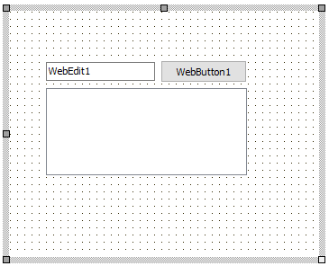
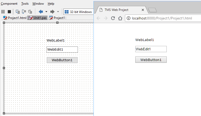
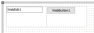
Let’s create step by step a first TMS WEB Core application. After creating a new TMS WEB Core project an opening the Delphi IDE form designed for the web form, let’s add a TWebButton, TWebEdit and TWebListBox:
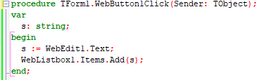
Now, let’s add a WebButton event handler for OnClick:
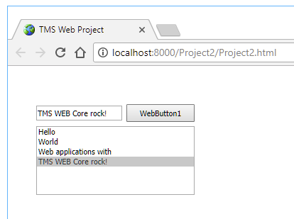
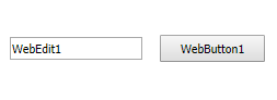
When running this project, the result we see in the browser is:
When you have compiled the application in debug mode, the output folder contains the following files:
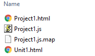
The file project1.js contains the Javascript compiled application. The file project1.html is the general project HTML file. The unit1.html is the HTML that is specific to form1 which is the default form in the project here. An interesting file is the project1.js.map file. This is the file that facilitates debugging directly using the Delphi language from the browser. When compiling in release mode, this file is not generated. When one would want to deploy the application to a web server, all that is needed to do is put the files project1.html / project1.js and unit1.html in a folder on a web server
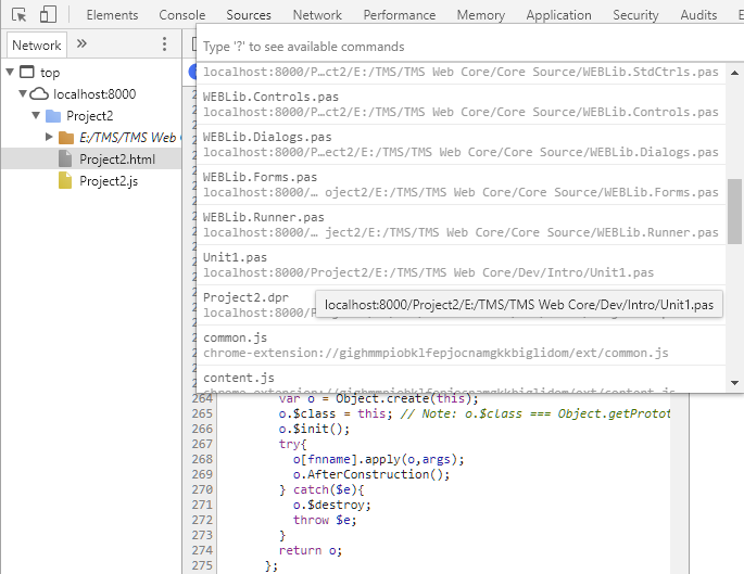
As explained in the previous paragraph, when compiling in the Delphi IDE in debug mode, the extra file project1.js.map is generated to offer the capability to debug the application directly from Delphi code in the browser. This capability is supported in both the Chrome and Firefox browser.
To start the debugger, press F12 from the browser and go to the Sources tab. On the source window, press shortcut Ctrl-P and you get to see the file list of all files involved in the project.
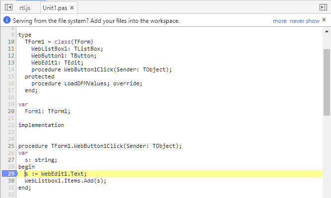
From the file list, pick unit1.pas:
After picking this file unit1.pas, you can add breakpoints by clicking in the line number gutter:
Now, adding a value in the TWebEdit control and pressing the TWebButton triggers the breakpoint:
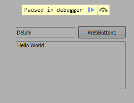
and as you can see in the browser debugger, you can step Delphi line by Delphi line through the code and see the values of Delphi variables directly in the browser debugger:
This shows how easy and comfortable it is to debug TMS WEB Core application using the Delphi language directly from the browser.
For creating the single-page JavaScript application, the Pascal code of your project is compiled to JavaScript and this JavaScript application runs in the browser. Typically a connection to the server will be made by HTTP REST requests or via WebSocket communication. To compile the Pascal code to JavaScript code, the pas2js compiler is used that is an open-source project and builds on years of experience of the FPC compiler team. More information about the pas2js project can be found here: http://wiki.freepascal.org/pas2js
At this moment, this support for the Pascal language is highly compatible with the Delphi language. Some newer Delphi language features are not yet supported in v1.0 though but are on the roadmap. The language features not yet supported but planned for the 2018 – 2019 timeframe are:
For more details about the capabilities of the pas2js compiler, please refer to * http://wiki.freepascal.org/pas2js#Compiler TMS WEB Core ships with a validated version of the pas2js compiler. We recommend using the pas2js compiler included in the TMS WEB Core distribution as this is the version we test & approve our entire framework and IDE integration with.
Equally important to move existing VCL or FMX code bases to the web is the support for RTL. A huge part of the Delphi RTL is available and delivered with the compiler. This includes now:
There is a basic Object Pascal RTL, several units from the FPC Packages are also available
For more information about RTL support, please see: http://wiki.freepascal.org/pas2js#RTL
The unit WEBLib. WebTools contains several helper functions that can be handy.
The list of available utility functions is: procedure MessageBeep(AType: integer); Method with a VCL compatible signature playing a beep in the browser.
procedure OutputDebugString(const s: string);
Sends the string to the browser event log
function GetTickCount: longint;
Returns the number of ticks since browser start in milliseconds
function GetQueryParam(AName: string): string;
Returns the URL query parameter value for the URL with which the web application was started. Example: https://www.myserver.com/mysite?user=Admin with return ‘Admin’ for GetQueryParam(‘user’);
function HasQueryParam(AName: string; var AValue: string): boolean;
Returns true if a specific query parameter is present in the URL with which the application was launched.
function GetLocaleShortDateFormat(ALocale: string = ''): string;
Gets the short date format according to the browser locale
function GetLocaleLongDayName(DayOfWeek: integer; ALocale: string =
''): string;
Gets the long day name for a specific day in the week according to the browser locale 29 TMS SOFTWARE TMS WEB Core DEVELOPERS GUIDE
function GetLocaleShortDayName(DayOfWeek: integer; ALocale: string =
''): string;
Gets the short day name for a specific day in the week according to the browser locale
function GetLocaleLongMonthName(Month: integer; ALocale: string = ''):
string;
Gets the long month name for a specific day in the week according to the browser locale
function GetLocaleShortMonthName(Month: integer; ALocale: string =
''): string;
Gets the short month name for a specific day in the week according to the browser locale
function GetLocaleDecimalSeparator: string;
Gets the decimal separator character according to the browser locale
function GetBrowserLocale: string;
Retrieves the browser locale as string. See appendix for possible locale names.
By default, the Delphi form designer serves as a WYSIWYG design surface for your web application forms. This means that the UI controls on the Delphi form will appear absolute positioned on the web page. For page layout & organization, there are the typical Delphi container controls like a panel, groupbox, scrollbox, gridpanel.
The parent/child relationship of the Delphi controls is also reflected on the produced web pages. Additional facilities like control alignment, anchoring and a splitter control are available to let you and the end user control the layout of the pages. In this default mode, everything is as such very familiar to Delphi developers and users of Delphi VCL Windows applications and sometimes this similarity is desirable. However, the TMS WEB Core framework is also completely open to have the page layout designed directly from HTML & CSS. The architecture of the framework provides for separating design & code and even have the design done by people with a role, i.e. graphical designers.
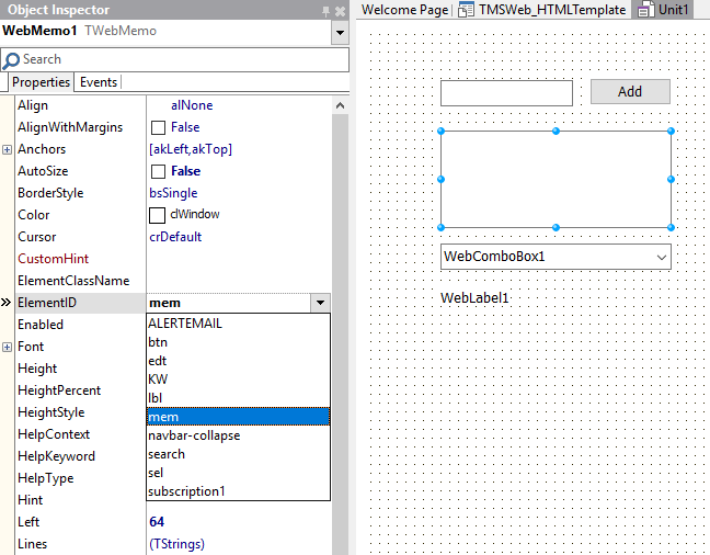
So, how is this separation handled? Fortunately, in a very easy and straightforward way. The link between HTML and the UI controls and code used in the Delphi IDE is based on the unique HTML element ID. Every TMS WEB Core control has a property ElementID. When the ElementID is not used, i.e. left empty, the HTML elements the control consists of is generated by the TMS WEB Core framework. When the ElementID is specified, the HTML element found is hooked up to the Pascal class for the control. This means that property accessors directly get and set values from the HTML element and the various HTML element Javascript events are hooked up the class and exposed as Pascal event handlers. Here the TWebMemo is hooked up via the ElementID property to a TEXTAREA HTML element with ID set to “mem” and already in the HTML file.
The software developer and the graphical designer can collaborate by simply ensuring that the designer provides the HTML element IDs to the software developer or the software developer can provide a list of IDs of controls needed to the graphical designer. It speaks for itself that using this technique empowers us to take advantage of responsive design for TMS WEB Core web applications. When the HTML template for the page is applying responsive design techniques, i.e. different layouts for different device screen sizes, the UI controls will appear where the designer defined these should appear depending on the screen size. That is not all though. It is also possible to let the Delphi designed UI be generated in the body part of a HTML page or in any specified HTML container element in a HTML page. As such, a graphical designer could create a page layout with a header, footer and other elements in the HTML page and add a specific area via a HTML DIV or SPAN element where the Delphi designed UI will be generated in. To do so, all that is needed is set to the ID for the HTML element where the form should be generated via the Form.AppContent property. Finally, each UI control also exposes an ElementClass property. Via this ElementClass property a CSS style can be specified for an UI control. Via this way for example, it is very easy to use a popular framework like bootstrap. It is sufficient to set the bootstrap CSS class names to the UI controls on the Delphi form designer by their ElementClass properties.
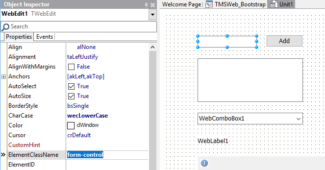
Here the ElementClass property of the edit control on the form is set to the bootstrap ‘form-control’ style:
One of the demos included in the TMS WEB Core framework shows this. By simply changing the bootstrap theme via changing the reference in the HTML page template, the appearance of the web application will adapt automatically.
Demo without styling: http://www.tmssoftware.biz/tmsweb/demos/tmsweb_simple/
Demo with bootstrap styling applied: http://www.tmssoftware.biz/tmsweb/demos/tmsweb_bootstrap/
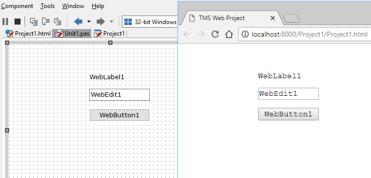
Further fine-tuning on how the design-time setup translates to run-time look & feel and layout is possible via the UI control properties ElementFont and ElementPosition.
Default, the UI control ElementFont property is set to efProperty. This means that the UI control Font property values will be used to generate the style attributes for the HTML element (in case ElementID and ElementClassName are blank). When ElementFont is set to efCSS, this means the font for the HTML element will be determined by the browser CSS resolving.
Example:
This is a TMS WEB Core project web form with 3 controls. The font for the controls was set at design-time to Verdana, 10pt. In the browser, this renders exactly the same:
Now, changing the ElementFont property on the 3 controls to efCSS and including the following CSS in the form’s unit1.html:
results in:
The ElementPosition property determines how the form designer based coordinates are used as style attributes for the HTML element. When ElementPosition is set to epAbsolute (default), the HTML element style attributes are set to absolute and the control position and size will match exactly how it was designed in the form designer. When the setting is epRelative or epNone, the HTML element layout, position and size will be determined by the browser and possible CSS applied to the HTML element(s).
In the previous paragraph, it was explained how a form uses a HTML file and that the HTML file can contain HTML elements, CSS, JavaScript as well as references to existing JavaScript libraries and CSS. While these references can always be manually added to the HTML file, the IDE also provides for automatic insertion or removal of such references. To do this, choose from the project context menu in the IDE the menu option:
“Manage JavaScript Libraries …”
This brings a dialog with several preconfigured popular JavaScript libraries that can be added:
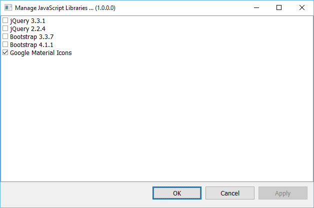
From this dialog, simply check the JavaScript libraries you want to use for your project.
Just like in a VCL application, a TMS WEB Core application has a singleton TApplication object. The application is mainly responsible for creating and managing forms and provides in addition a couple of methods, properties and events to help in various ways. The Application object is also responsible to retrieve various formatting settings (date, time, numbers) from the browser locale.
Normally, the IDE will automatically generate the needed code so the main application form is created. Following methods, properties and events are available:
| Property | Description |
|---|---|
| Application.CreateForm(AInstanceClass: TFormClass; var Reference); | Creates a new instance of a form class. The new form instance is returned via the AReference parameter. Note that creating a new form involves loading the form HTML file and as such, this is an asynchronous process.Creates a new instance of a form class. The new form instance is returned via the AReference parameter. Note that creating a new form involves loading the form HTML file and as such, this is an asynchronous process. |
| Application.CreateForm(AInstanceClass: TFormClass; AElementID: string; var Reference); | Creates a new instance of a form class. The new form instance is returned via the AReference parameter. The form content is loaded in the HTML element set via ElementID. Thus, the form is hosted in the element in the form that contains it. Note that creating a new form involves loading the form HTML file and as such, this is an asynchronous process. |
| Application.CreateForm(AInstanceClass: TFormClass; AElementID: string; var Reference; AProc: TFormCreatedProc); | Overload of the CreateForm() method that has an extra parameter AProc. This allows to pass a procedure pointer for the procedure that will be called when the asynchronous creation of the form is ready. |
| Application.CreateForm(AInstanceClass: TDataModuleClass; var Reference); | Creates a new instance of a data module |
| Application.ErrorType | Defines the type of error messages that is displayed. aeSilent: non-obtrusive message in the browser console. Default when application is compiled in release mode aeDialog: HTML dialog with error message centered in browser window aeAlert:Javascript alert with error message aeFooter: Rectangular area in footer of browser window containing error message |
| Application.LoadForm(AForm: TCustomForm; AFormFile: string); | This allows to override the automatic initialization of format settings from the default browser locale. See Appendix for possible browser locale values. |
| Application.Navigate(AURL: string; ATarget: TNavigationTarget); | Method to navigate from the application to a given URL. With the ATarget parameter it can be set to navigate to the URL in a new browser window or in the window where the current application is running. |
| Application.MainForm | Returns the form instance that is the current active main form of application. |
| Application.Parameters: TStrings; | Returns the list of possible optional URL request parameters with which the application was started |
| Application.Language: TUILanguage | Sets optionally the application language. When the application language is set, it is possible that a language specific HTML file for a form is loaded. Default, Application.Language is set to lNone. When Application.Language is set to a different value, the HTML file loaded for a form gets a language specific suffix. For example, when Application.Language is set to lGerman, the application will load for a form in unit1.pas and having the form HTML file named unit1.html as unit1_de.html. This way, it is possible to have different language specific HTML files and have the application load the desired HTML form file when the language is set. The list of supported languages and the used language suffix is found in the appendix. |
| Application.OnError | Event triggered when an error occurs in the application. This can be a Pascal exception or any HTML DOM specific error. The event passes the information about the error in the parameter AError: TAppplicationError. When the Handled parameter is set to true, the standard error is not longer performed. |
| Application.OnImageCacheReady | Event triggered when images that were set to be loaded by setting the URL are finished with loading asynchronously. It might be necessary to force a repaint of controls from this event. |
In TMS WEB Core, the base class for forms is TWebForm.TWebForm is similar to a TForm in the VCL. Controls can be put at design time on the TWebForm and will be displayed. The TWebForm is by default displayed as a full page in the browser. In addition to the controls that the form hosts that are created at design-time or at runtime, there is also the HTML code associated with the form. This HTML can be an empty HTML BODY when all controls are created by Delphi classes or it can contain additional HTML elements or HTML elements to which Delphi classes are mapped.
The default project looks like:
and you see under unit1.pas not only a reference to the DFM file where Delphi class properties are stored but also the HTML file associated with the form in Unit1. The default HTML for this form can be opened & edited from the Delphi IDE but can also be ‘designed’ by any other tool for creating HTML files. The default content of the HTML file is:
In the default HTML files, the BODY is empty and the controls defined in Delphi will be put in the BODY upon creation of the form instance. The application creates the main form in the same way as in a VCL application, i.e. with the code:
Application.CreateForm(TForm1, Form1);
It is also possible that the Delphi controls will be created within another HTML element than the HTML BODY element.
If unit1.html contains:
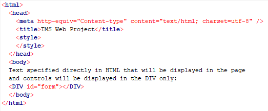
we can specify at form class level Form.FormContainer: string and set this to the HTML element ID of the HTML element in which the form should be rendered, i.e. in this case it could be set to “form”.
Due to the asynchronous behaviour of loading the HTML for a form, the creation of a form in code is slightly different in the web than in VCL. To create a form, following code can be used:
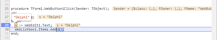
procedure TForm1.WebButton1Click(Sender: TObject);
var
  newform: TForm2;

  // async called when the form is closed (via form.Close method where ModalResult can be set)
  procedure AfterShowModal(AValue: TModalResult);
  begin
    ShowMessage('Form 2 closed with new value:'+newform.frm2Edit.Text);
    WebEdit1.Text := newform.frm2Edit.Text;
  end;

  // async called OnCreate for TForm2
  procedure AfterCreate(AForm: TObject);
  begin
    (AForm as TForm2).frm2Edit.Text := WebEdit1.Text;
  end;

begin
  newform := TForm2.CreateNew(@AfterCreate);
  newform.ShowModal(@AfterShowModal);
end;
By default, the new form TForm2 will replace the page showing the actual form. When this form is closed, the original form from where TForm2 is shown, will be displayed in the browser page again. The procedure AfterCreate is shown when the HTML for TForm2 is loaded and its controls are created. The ShowModal() method will display the actual form in the browser page and a reference to the method that will be called when the form is closed can be passed as parameter as ShowModal is not a blocking method, as such blocking methods are not possible in a browser environment.
In addition to forms displayed in the full browser page, it is also possible to create popup forms. These forms will be displayed on top of other forms, effectively disabling the forms on top of which the new form is displayed till this new form is closed. To display a form as popup, all that is needed is setting form.Popup = true.
Example:
begin
  newform := TForm2.CreateNew(@AfterCreate);
  newform.Popup := true;
  newform.ShowModal(@AfterShowModal);
end;
Finally, it is also possible to embed other forms in controls or HTML elements in other forms. To do so, create the form with overloads of the CreateForm method of the Application object or via the CreateNew constructor overload of TWebForm:
##Via the TApplication object:
    procedure CreateForm(AInstanceClass: TWebFormClass; AElementID: string; var AReference); overload;

    procedure CreateForm(AInstanceClass: TWebFormClass; AElementID: string; var AReference; AProc: TFormCreatedProc); overload;
The AInstanceClass is the class type of the form to be created. The AElementID is the ID of the HTML element (or Delphi class control ID) that is the HTML container in which the form will be created. The AReference is a reference to the form instance that will be created and optionally a referene to a procedure that will be called when the form was effectively created can be passed.
Via the TWebForm CreateNew overload:
constructor TWebForm.CreateNew(AElementID: string; AProc: TFormCreatedProc);
The AElementID is the ID of the HTML element (or Delphi class control ID) that is the HTML container in which the form will be created. Optionally a method can be passed that will be called when the form was created.
Example code:
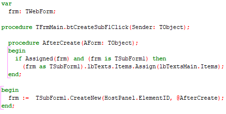
In this sample code, a new form of the type TSubForm is created. The form will be displayed inside a panel on the form as we use the panel’s HTML element ID. When the form is created, and this all controls on the form are accessible, the AfterCreate() procedure is called.
TMS WEB Core supports types of UI controls
These are UI controls that are built-up from one or more HTML elements. All UI controls included in TMS WEB Core are of this type. In its most basic form, this is for example a TWebButton that maps on a HTML
<BUTTON>
 element. In a more complex form, this is a TWebLoginPanel that consists
of several
<INPUT> elements, a <BUTTON> element and <DIV> elements.
The TMS FNC component framework is an abstraction layer that facilitates writing UI controls with a single code base that can be used for VCL, FMX, LCL and also TMS WEB Core applications. Several TMS FNC products, i.e. TMS FNC Chart, TMS FNC UI Pack and TMS FNC Dashboard Controls Pack support to use of the components also in web applications. For documentation about FNC controls, this is included in the different TMS FNC products and all documentation that applies to use of the controls in VCL, FMX or LCL applications also applies to use of the controls in TMS WEB Core applications.
Several controls are provided that are actually Pascal wrapper classes for underlying jQuery UI controls. This includes a set of Pascal wrapper classes for the jQWidget controls (www.jqwidgets.com)
TMS WEB Core comes with a lot of components out of the box enabling you to go ahead immediately creating web applications from the Delphi IDE. Many of these standard controls resemble VCL controls and great care has been taken to give these controls class names and properties, methods and event handlers that match their VCL counterparts. This has been done to make the learning curve for Delphi developers used to create Windows VCL applications as light as possible to create web applications. The standard controls have the prefix “TWeb”, i.e. where in VCL a TButton is used, there is in TMS WEB Core a component TWebButton. Where there is in VCL a TListBox, in TMS WEB Core, its counterpart is TWebListBox etc…
Visual controls are descending from TControl. For controls without a Canvas, i.e. controls that map directly on a hierary of HTML elements (excluding the HTML5 CANVAS element), TWinControl descending from TControl is defined. Controls doing custom painting are descending from TCustomControl that descends from TControl. Finally, when the control does not need user-interface interaction via mouse or keyboard, the TGraphicControl is introduced that descends from TCustomControl. At TControl level, a number of properties is introduced that are then further common for all descending user interface controls.
| Property | Description |
|---|---|
| Align | Sets the alignment of the control in relationship to its parent control: alLeft: control aligns to the right-side of its parent alTop:control aligns to the top of its parent alBottom:aligns to the bottom of its parent alRight:aligns to the right-side of its parent alClient:aligns to the client-size of its parent |
| AlignWithMargin | When true, the margins settings are taking in account for calculating the alignment |
| Anchors | Gets or sets the anchoring of the control. Values can be akLeft akTop akRight akBottom |
| Cursor | Sets the mouse cursor used when the mouse is over the control |
| Enabled | Sets the control to enabled or disabled |
| ElementClassName | Sets the CSS class name(s) for the HTML element used to represent the control |
| ElementFont | Sets whether the control Font property is used to set the font (efProperty) or CSS will control the font (efCSS) |
| ElementID | Sets the HTML ID of the HTML element already present in the HTML document that the Pascal class needs to connect to (instead of creating a new HTML element instance) |
| ElementPosition | Sets the position of the element in the HTML page as epAbsolute, epRelative or epNone. |
| Height | Absolute height value for the control |
| HeightPercent | Height value used when HeightStyle is ssPercent |
| HeightStyle | When HeightStyle is set to ssAbsolute, the Height value is used to set the absolute height of the container HTML element of the control. When HeightStyle is set to ssPercent, the HeightPercent value is used. When HeightStyle is set to ssNone, no height is specified on the container HTML element, meaning it will auto size. |
| Hint | Sets the hint value for the container HTML element |
| Margins | Sets the margin values f |
| ShowHint | When true, the hint is used for the control |
| Visible | When true, the control is visible |
| Width | Absolute width value for the control |
| WidthPercent | Width value used when WidthStyle is ssPercent |
| Width value used when WidthStyle is ssPercent | When WidthStyle is set to ssAbsolute, the Width value is used to set the absolute width of the container HTML element of the control. When WidthStyle is set to ssPercent, the WidthPercent value is used. When WidthStyle is set to ssNone, no width is specified on the container HTML element, meaning it will auto size. |
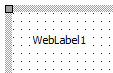
Below is a list of the most important properties methods and events for the TWebLabel. TWebLabel is a label control similar to a VCL TLabel.
 |
 |
|---|---|
| Designtime | Runtime |
| Property | Description |
|---|---|
| Alignment | Sets the alignment of the text within the label control |
| AutoSize | When true, the size of the label adapts to the text in the label |
| Caption | Sets the text for the label |
| ElementClassName | Optionally sets the CSS classname for the label when styling via CSS is used |
| ElementID | Optionally sets the HTML element ID for a HTML element in the form HTML file the label needs to be connected with. When connected, no new label is created but the Delphi class is connected with the existing HTML element in the form HTML file |
| EllipsisPosition | Sets the type of ellipsis to use for showing the text when it doesn’t fit in the label rectangle. epNone: no ellipsis used epEndEllipsis: ellipsis at the end of the text epPathEllipsis: label text contains a path name and ellipsis is set taking a file path in account epWordEllipsis: ellipsis is positioned at word boundary |
| Layout | Sets the vertical text position in the label tlTop: top aligned tlCenter: center aligned tlBottom: bottom aligned |
| Transparent | When true, no background color is used |
| WordWrap | When true, the text is rendered with automatic wordwrap |
| Property | Description |
|---|---|
| OnClick | Triggered when the mouse is clicked on the label |
| OnDblClick | Triggered when the mouse is double-clicked on the label |
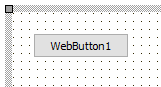
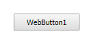
Below is a list of the most important properties methods and events for TWebButton. TWebButton is a button control similar to a VCL TButton control
 |
 |
|---|---|
| Designtime | Runtime |
| Property | Description |
|---|---|
| Caption | Sets the text for the button |
| ElementClassName | Optionally sets the CSS classname for the button when styling via CSS is used |
| ElementID | Optionally sets the HTML element ID for a HTML BUTTON element in the form HTML file the button needs to be connected with. When connected, no new button is created but the Delphi class is connected with the existing HTML element in the form HTML file |
| TabOrder | Sets the tab order of the control |
| TabStop | When true, the focus is turned to the control when pressing tab |
| TextDirection | Sets the text direction to tdDefault: does not use direction attribute tdInherit: uses TextDirection of parent control tdRightToLeft:uses rtl direction attribute tdLeftToRight: uses ltr direction attribute |
| Property | Description |
|---|---|
| OnClick | Event is triggered when the button is clicked |
| OnEnter | Event triggered when the button gets focus |
| OnExit | Event triggered when the focus leaves the button |
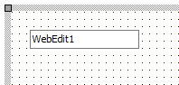
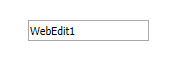
sBelow is a list of the most important properties methods and events for TWebEdit. TWebEdit is an edit input control similar to a TEdit in VCL.
 |
 |
|---|---|
| Designtime | Runtime |
| Property | Description |
|---|---|
| AutoCompletion | Sets the auto completion type that the browser uses to fill the edit controls on a form based on its cache of entries previously made. Note that in order to have autocompletion working, it is required that the TWebEdit control is placed on a TWebHTMLForm |
| BorderStyle | Sets the border style for the control |
| ElementClassName | Optionally sets the CSS classname for the edit control when styling via CSS is used |
| ElementID | Optionally sets the HTML element ID for a HTML INPUT element in the form HTML file the edit control needs to be connected with. When connected, no new edit control is created but the Delphi class is connected with the existing HTML element in the form HTML file |
| SelLength | Gets or sets the length of selected text in the edit control |
| SelStart | Gets or sets the caret position in the edit control |
| ShowFocus | When true, the border color changes when the control has focus |
| TabOrder | Sets the tab order of the control |
| TabStop | When true, the focus is turned to the control when pressing tab |
| Text | Gets or sets the text of the edit control |
| TextDirection | Sets the text direction to tdDefault: does not use direction attribute tdInherit: uses TextDirection of parent control tdRightToLeft:uses rtl direction attribute tdLeftToRight: uses ltr direction attribute |
| Property | Description |
|---|---|
| Clear | Removes text from the edit |
| ClearSelection | Removes the selected text from the edit |
| Property | Description |
|---|---|
| Clear | Removes text from the edit |
| ClearSelection | Removes the selected text from the edit |
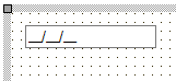
Below is a list of the most important properties methods and events for TWebSpinEdit. TWebSpinEdit is an edit control with an embedded spin up & down button, similar to a VCL TSpinEdit. The TWebSpinEdit requires a fully HTML5 compliant browser.
 |
 |
|---|---|
| Designtime | Runtime |
| Property | Description |
|---|---|
| AutoSize | When true, the width of the control adapts to the text |
| BorderStyle | Sets the border style for the control |
| ElementClassName | Optionally sets the CSS classname for the spin control when styling via CSS is used |
| ElementID | Optionally sets the HTML element ID for a HTML element in the form HTML file the spin control needs to be connected with. When connected, no new spin contrl is created but the Delphi class is connected with the existing HTML element in the form HTML file |
| Increment | Gets or sets the step to increment the value with the up/down buttons |
| ShowFocus | When true, the border color changes when the control has focus |
| TabOrder | Sets the tab order of the control |
| TabStop | When true, the focus is turned to the control when pressing tab |
| TextDirection | Sets the text direction to tdDefault: does not use direction attribute tdInherit: uses TextDirection of parent control tdRightToLeft:uses rtl direction attribute tdLeftToRight: uses ltr direction attribute |
| Value | Sets or gets the value of the control |
| Property | Description |
|---|---|
| OnChange | Event triggered when the value of the spin edit control changes from the UI |
| OnClick | Event triggered when the control is clicked |
| OnDblClick | Event triggered when the control is double-clicked |
| OnEnter | Event triggered when the control gets focus |
| OnExit | Event triggered when focus leaves the control |
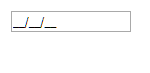
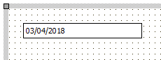
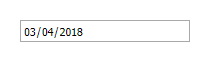
Below is a list of the most important properties methods and events for TWebMaskEdit. TWebMaskEdit is an edit control with a edit mask capability that controls what character(s) can be typed at what position in the edit control, similar to a VCL TMaskEdit.
 EditMask property set to: !99/99/00;1; EditMask property set to: !99/99/00;1; |
 |
|---|---|
| Designtime | Runtime |
| Properties | Description |
|---|---|
| Alignment | Sets the alignment of the entered text in the edit control |
| AutoSelect | When true, all text gets selected when the control gets focus |
| AutoSelect | When true, the width of the control adapts to the text |
| BorderStyle | Sets the border style for the control |
| CharCase | Sets the border style for the control |
| EditMask | Sets the mask for the inplace editor. The mask that can be used for the TWebMaskEdit is compatible with the mask available for a VCL TMaskEdit control. The description of the mask capabilities can be found here: http://docwiki.embarcadero.com/Libraries/Tokyo/en/System.MaskUtils.TEditMask |
| EditText | Sets & gets the value of the edit control without taking the mask in account |
| ElementClassName | Optionally sets the CSS classname for the spin control when styling via CSS is used |
| ElementID | Optionally sets the HTML element ID for a HTML element in the form HTML file54 the spin control needs to be connected with. When connected, no new spin contrl is created but the Delphi class is connected with the existing HTML element in the form HTML file |
| ShowFocus | When true, the border color changes when the control has focus |
| TabOrder | Sets the tab order of the control |
| TabStop | When true, the focus is turned to the control when pressing tab |
| Text | Sets or gets the text in the edit control |
| Properties | Description |
|---|---|
| OnChange | Event triggered on key down in the editcontrol |
| OnClick | Event triggered when the control is clicked |
| OnDblClick | Event triggered when the control is doubleclicked |
| OnEnter | Event triggered when the control gets focus |
| OnExit | Event triggered when focus leaves the control |
| OnKeyDown | Event triggered on key down in the edit control |
| OnKeyPress | Event triggered on key press in the edit control |
| OnKeyUp | Event triggered on key up in the edit control |
Below is a list of the most important properties methods and events for the TWebDateTimePicker. TWebDateTimePicker allows to select a date or time, similar to a date/time picker in VCL. This control requires a fully HTML5 compliant browser.
 |
 |
|---|---|
| Designtime | Runtime |
| Property | Description |
|---|---|
| BorderStyle | Sets the border style for the control |
| Date | Gets or sets the date value of the control |
| ElementClassName | Optionally sets the CSS classname for the date/time picker when styling via CSS is used |
| ElementID | Optionally sets the HTML element ID for a HTML element in the form HTML file the date picker needs to be connected with. When connected, no new date picker is created but the Delphi class is connected with the existing HTML element in the form HTML file |
| Kind | Configures the control as date or as time picker |
| ShowFocus | When true, the border color changes when the control has focus |
| TabOrder | Sets the tab order of the control |
| When true, the focus is turned to the control when pressing tab | When true, the focus is turned to the control when pressing tab |
| Time | Gets or sets the |
| Property | Description |
|---|---|
| OnChange | Event triggered when the control is clicked |
| OnClick | Event triggered when the control is clicked |
| OnDblClick | Event triggered when the control is double-clicked |
| OnEnter | Event triggered when the control gets focus |
| OnExit | Event triggered when focus leaves the control |
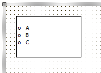
Below is a list of the most important properties methods and events for TWebListBox. A TWebListBox is a control having a list of (text) items, similar to a VCL TListBox.
 |
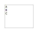 |
|---|---|
| Designtime | Runtime |
| Property | Description |
|---|---|
| BorderStyle | Sets the border style for the control |
| ElementClassName | Optionally sets the CSS classname for the date/time picker when styling via CSS is used |
| ElementID | Optionally sets the HTML element ID for a HTML element in the form HTML file the date picker needs to be connected with. When connected, no new date picker is created but the Delphi class is connected with the existing HTML element in the form HTML file |
| Enabled | Sets whether the control is enabled or disabled |
| ItemHeight | Sets the height of individual items in the listbox |
| ItemIndex | Sets or gets the index of the selected item |
| Items | Access to the items in the listbox as a TStringList |
| MultiSelect | When true, multiple items can be selected in the listbox |
| ShowFocus | When true, the border color changes when the control has focus |
| TabOrder | Sets the tab order of the control |
| TabStop | When true, the focus is turned to the control when pressing tab |
| Property | Description |
|---|---|
| OnChange | Event triggered when the selected item changes in the listbox |
| OnClick | Event triggered when the listbox is clicked |
| OnDblClick | Event triggered when the listbox is double-clicked |
| OnEnter | Event triggered when the control gets focus |
| OnExit | Event triggered when focus leaves the control |
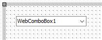 |
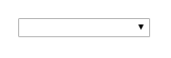 |
|---|---|
| Designtime | Runtime |
| Property | Description |
|---|---|
| ElementClassName | Optionally sets the CSS classname for the label when styling via CSS is used |
| ElementID | Optionally sets the HTML element ID for a HTML element in the form HTML file the label needs to be connected with. When connected, no new label is created but the Delphi class is connected with the existing HTML element in the form HTML file |
| ItemIndex | Sets or gets the index of the selected item |
| Items | Access to the items in the listbox as a TStringList |
| ShowFocus | When true, the border color changes when the control has focus |
| TabOrder | Sets the tab order of the control |
| TabStop | When true, the focus is turned to the control when pressing tab |
| Text | Gets or sets the selected value in the combobox |
| Property | Description |
|---|---|
| OnChange | Event triggered when the selected item changes in the listbox |
| OnClick | Event triggered when the listbox is clicked |
| OnDblClick | Event triggered when the listbox is double-clicked |
| OnEnter | Event triggered when the control gets focus |
| OnExit | Event triggered when focus leaves the control |
Below is a list of the most important properties methods and events for TWebColorPicker. TWebColorPicker is a control to allow selecting a color. Note that a browser with full HTML5 compliance is needed for this control
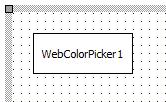 |
 |
|---|---|
| Designtime | Runtime |
| Property | Description |
|---|---|
| Color | Gets or sets the selected color of the color picker |
| ElementClassName | Optionally sets the CSS classname for the label when styling via CSS is used |
| ElementID | Optionally sets the HTML element ID for a HTML element in the form HTML file the label needs to be connected with. When connected, no new label is created but the Delphi class is connected with the existing HTML element in the form HTML file |
| Property | Description |
|---|---|
| OnSelect | Event triggered when a color is selected via the color picker |
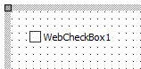
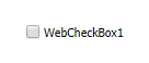
Below is a list of the most important properties methods and events for TWebCheckBox, TWebCheckBox represents a two-state checkbox or three-state checkbox and is similar to a VCL TCheckBox
 |
 |
|---|---|
| Designtime | Runtime |
| Property | Description |
|---|---|
| Caption | Sets or gets the text for the checkbox |
| Checked | Sets or gets the checkbox state |
| ElementClassName | Optionally sets the CSS classname for the label when styling via CSS is used |
| ElementID | Optionally sets the HTML element ID for a HTML element in the form HTML file the label needs to be connected with. When connected, no new label is created but the Delphi class is connected with the existing HTML element in the form HTML file |
| ShowFocus | When true, the border color changes when the control has focus |
| State | Allows to get or set the checkbox state in three states: checked, unchecked, grayed. |
| TabOrder | Sets the tab order of the control |
| TabStop | When true, the focus is turned to the control when pressing tab |
| Property | Description |
|---|---|
| OnClick | Event triggered when the checkbox is clicked |
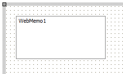
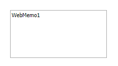
Below is a list of the most important properties methods and events for the TWebMemo. TWebMemo is a multiline editable control, similar to a VCL TMemo. It is based on the HTML TEXTAREA element.
 |
 |
|---|---|
| Designtime | Runtime |
| Property | Description |
|---|---|
| AutoSize | When true, the size of the control will automatically adapt to the text in the memo |
| BorderStyle | Sets the border style of the control |
| ElementClassName | Optionally sets the CSS classname for the label when styling via CSS is used |
| ElementID | Optionally sets the HTML element ID for a HTML element in the form HTML file the label needs to be connected with. When connected, no new label is created but the Delphi class is connected with the existing HTML element in the form HTML file |
| Lines | Access to the content of the memo via a TStringList property |
| SelLength | Gets or sets the length of the selection in the memo |
| SelStart | Gets or sets the selection starting point in the memo |
| ShowFocus | When true, the border color changes when the control has focus |
| TabOrder | Sets the tab order of the control |
| TabStop | When true, the focus is turned to the control when pressing tab |
| Property | Description |
|---|---|
| Clear | Removes text from the memo |
| ClearSelection | Removes the selected text from the memo |
| Property | Description |
|---|---|
| OnChange | Event triggered when the content of the memo changes |
| OnClick | Event triggered when the memo is clicked |
| OnDblClick | Event triggered when the memo is double-clicked |
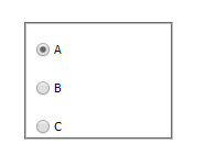
Below is a list of the most important properties methods and events for the TWebRadioGroup. TWebRadioGroup is a group of radio button controls similar to a VCL TRadioGroup.
 |
 |
|---|---|
| Designtime | Runtime |
| Property | Description |
|---|---|
| Caption | Sets the caption text of the radiogroup |
| Columns | Defines in how many columns the radiobuttons are displayed. Default is . |
| ElementClassName | Optionally sets the CSS classname for the label when styling via CSS is used |
| ElementID | Optionally sets the HTML element ID for a HTML element in the form HTML file the label needs to be connected with. When connected, no new label is created but the Delphi class is connected with the existing HTML element in the form HTML file |
| ItemIndex | Sets or gets the selected radio button in the group |
| Items | Access to the radio button captions in the group via a TStringList property |
| Property | Description |
|---|---|
| OnChange | Event triggered when the selected radio button in the radiogroup changes |
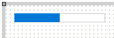
The TWebProgressBar is a progress indicating bar control that shows the progress (position) between a configurable minimum and maximum. It can be also be shown in marquee style, indicating that a process of indeterminate duration is busy.
 |
 |
|---|---|
| Designtime | Runtime |
| Property | Description |
|---|---|
| Max | Sets the maximum value of the progress bar |
| Min | Sets the minimum value of the progress bar |
| Position | Sets the position of the progress bar |
| Style | Sets the style of the progress bar: pbstNormal: normal progress bar style pbstMarquee: marquee progress bar style for processes of indeterminate duration pbstDIV: progressbar is made up of DIV elements that can be styled by Bootstrap |
The TWebBadge is a badge control that can be used standalone or as part of other controls (like a TWebListControl, TWebTableControl, …) The badge can work standalone but is also designed so it can directly use Bootstrap styles.
 |
 |
|---|---|
| Designtime | Runtime |
| Property | Description |
|---|---|
| Color | Sets the background color of the badge |
| Text | Sets the text in the badge |
| TextColor | Sets the badge text color |
Below is a list of the most important properties methods and events for the TWebPaintBox. TWebPaintBox is a group of radio button controls similar to a VCL TPaintBox.
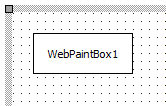 |
 |
|---|---|
| Designtime | Runtime |
| Property | Description |
|---|---|
| ElementClassName | Optionally sets the CSS classname for the label when styling via CSS is used |
| ElementID | Optionally sets the HTML element ID for a HTML element in the form HTML file the label needs to be connected with. When connected, no new label is created but the Delphi class is connected with the existing HTML element in the form HTML file |
| Property | Description |
|---|---|
| OnPaint | Event triggered when the paintbox needs to be repainted. The WebPaintBox.Canvas can be used as in the VCL TPaintBox to draw within the paintbox control |
| OnTouchEnd | Event triggered when a touch on the paintbox ends |
| OnTouchMove | Event triggered when a move is made while touching the paintbox control |
| OnTouchStart | Event triggered when a touch on the paintbox starts |
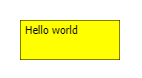
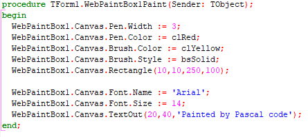
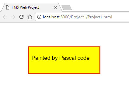
This example code snippet demonstrates how to paint something in the TWebPaintBox:
Result:
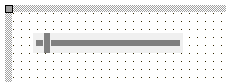
Below is a list of the most important properties methods and events for TWebTrackBar. TWebTrackBar is a trackbar control similar to a VCL TTrackBar. Note: in order to use the TWebTrackBar control, a fully HTML compliant browser is needed.
 |
 |
|---|---|
| Designtime | Runtime |
| Property | Description |
|---|---|
| ElementClassName | Optionally sets the CSS classname for the label when styling via CSS is used |
| ElementID | Optionally sets the HTML element ID for a HTML element in the form HTML file the label needs to be connected with. When connected, no new label is created but the Delphi class is connected with the existing HTML element in the form HTML file |
| Max | Sets the maximum value of the trackbar |
| Max | Sets the minimum value of the trackbar |
| Position | Sets the thumb position of the trackbar |
| TabOrder | Sets the tab order of the control |
| TabStop | When true, the focus is turned to the control when pressing tab |
| Property | Description |
|---|---|
| OnChange | Event triggered when the thumb on the trackbar is moved |
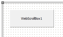
Below is a list of the most important properties methods and events for TWebScrollBox. TWebScrollBox is a container control that shows a scrollbar when it hosts child controls exceeding the client area of the control. TWebScrollBox is similar to a VCL TScrollBox.
 |
 |
|---|---|
| Designtime | Runtime |
| Property | Description |
|---|---|
| AutoScroll | When true, the scrollbar will be automatically displayed when child controls exceed the client rectangle of the scrollbox control |
| BorderStyle | Sets the border style of the scrollbox |
| ElementClassName | Optionally sets the CSS classname for the label when styling via CSS is used |
| ElementID | Optionally sets the HTML element ID for a HTML element in the form HTML file the label needs to be connected with. When connected, no new label is created but the Delphi class is connected with the existing HTML element in the form HTML file |
| Property | Description |
|---|---|
| OnClick | Event triggered when the scrollbox is clicked |
| OnClick | Event triggered when the scrollbox is double-clicked |
Below is a list of the most important properties methods and events for TWebSplitter. TWebSplitter is a splitter control that allows to change sizes of other controls aligned on the form when the splitter is moved. TWebSplitter is similar to the VCL TSplitter.
 |
 |
|---|---|
| Designtime | Runtime |
| Property | Description |
|---|---|
| ElementClassName | Optionally sets the CSS classname for the label when styling via CSS is used |
| ElementID | Optionally sets the HTML element ID for a HTML element in the form HTML file the label needs to be connected with. When connected, no new label is created but the Delphi class is connected with the existing HTML element in the form HTML file |
| ElementID | Sets the color of the grip dots in the middle of the splitter control |
| GripColor | Sets the color of the grip dots in the middle |
| of the splitter control |
| Property | Description |
|---|---|
| OnMoved | Event triggered when the splitter was moved by the user |
Below is a list of the most important properties methods and events for TWebPanel. TWebPanel is a container control that can host other child controls. TWebPanel is similar to a VCL TPanel.
 |
 |
|---|---|
| Designtime | Runtime |
| Property | Description |
|---|---|
| AutoSize | When true, the size of the panel automatically adapts to space the child controls it contains takes. |
| BorderStyle | Sets the style of the border |
| ElementClassName | Optionally sets the CSS classname for the label when styling via CSS is used |
| ElementID | Optionally sets the HTML element ID for a HTML element in the form HTML file the label needs to be connected with. When connected, no new label is created but the Delphi class is connected with the existing HTML element in the form HTML file |
| Property | Description |
|---|---|
| OnClick | Event triggered when the panel is clicked |
| OnDbClick | Event triggered when the panel is double-clicked |
Below is a list of the most important properties methods and events for TWebHTMLContainer. TWebHTMLContainer is basically a placeholder to add any HTML to be rendered on the page directly on the form. The HTML is added as text via the property WebHTMLContainer.HTML. The outer element of the HTML container is a DIV element.
|
|
|---|---|
| Designtime | Runtime |
| Properties | Description |
|---|---|
| HTML | A stringlist holding the HTML (as text) that will be rendered in a DIV |
| ElementClassName | |
| ElementID | Optionally sets the HTML element ID for a HTML element in the form HTML file the label needs to be connected with. When connected, no new label is created but the Delphi class is connected with the existing HTML element in the form HTML file |
| Properties | Description |
|---|---|
| OnClick | Event triggered when the outer DIV of the HTML container is clicked |
| OnDblClick | Event triggered when the outer DIV of the HTML container is double-clicked |
| OnMouseDown | Event triggered when the outer DIV of the HTML container is double-clicked |
| OnMouseUp | Event triggered when the mouse goes up on the outer DIV of the HTML container |
| OnMouseMove | Event triggered when the mouse moves over the outer DIV of the HTML container |
|
|
|---|---|
| Designtime | Runtime |
| Properties | Description |
|---|---|
| Name | Sets the name of the HTML FORM element |
Below is a list of the most important properties methods and events for TWebImageControl. TWebImageControl can display an image on the form. TWebImageControl is similar to a VCL TImage.
 |
 |
|---|---|
| Designtime | Runtime |
| Property | Description |
|---|---|
| AutoSize | When true, the size of the control automatically adapts to the size of the image it contains |
| ElementClassName | Optionally sets the CSS classname for the label when styling via CSS is used |
| ElementID | Optionally sets the HTML element ID for a HTML element in the form HTML file the label needs to be connected with. When connected, no new label is created but the Delphi class is connected with the existing HTML element in the form HTML file |
| Picture | Sets the picture at design time. Note that the image is automatically deployed by the compiling process to a separate image file with a unique name. |
| URL | Specifies the image as an URL |
| Property | Description |
|---|---|
| OnClick | Event triggered when the image is clicked |
| OnDblClick | Event triggered when the image is double-clicked |
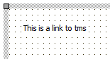
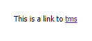
Below is a list of the most important properties methods and events for TWebLinkLabel. TWebLinkLabel is similar to a VCL TLinkLabel.
For a sample TWebLinkLabel with caption set to:
This is a link to tms
the result is:
 |
 |
|---|---|
| Designtime | Runtime |
| Property | Description |
|---|---|
| AutoSize | Optionally sets the CSS classname for the label when styling via CSS is used |
| ElementClassName | Optionally sets the CSS classname for the label when styling via CSS is used |
| ElementID | Optionally sets the HTML element ID for a HTML element in the form HTML file the label needs to be connected with. When connected, no new label is created but the Delphi class is connected with the existing HTML element in the form HTML file |
| EllipsisPosition | Sets the type of ellipsis to use for showing the text when it doesn’t fit in the label rectangle. |
epNone: no ellipsis used epEndEllipsis: ellipsis at the end of the text epPathEllipsis: label text contains a path name and ellipsis is set taking a file path in account epWordEllipsis: ellipsis is positioned at word boundary | | Layout | Sets the vertical text position in the label tlTop: top aligned tlCenter: center aligned tlBottom: bottom aligned | | WordWrap | When true, the text can be displayed wordwrapped in the label client rect |
| Property | Description |
|---|---|
| OnClick | Triggered when the label is clicked |
| OnDblClick | Triggered when the label is double-clicked |
| OnLinkClick | Event triggered when a hyperlink in the TWebLinkLabel is clicked |
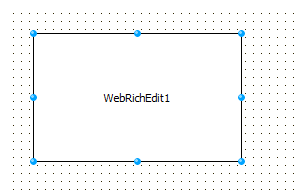
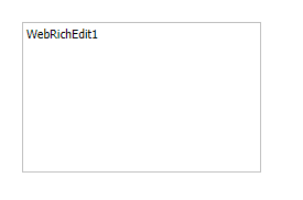
Below is a list of the most important properties methods and events for TWebRichEdit. TWebRichEdit is a control that allows to edit text and apply text formatting. TWebRichEdit is similar to a VCL TRichEdit.
 |
 |
|---|---|
| Designtime | Runtime |
| Property | Description |
|---|---|
| AutoSize | When true, the size of the label control automatically adapts to the text it contains |
| BorderStyle | Sets the border style |
| ElementClassName | Optionally sets the CSS classname for the label when styling via CSS is used |
| ElementID | Optionally sets the HTML element ID for a HTML element in the form HTML file the label needs to be connected with. When connected, no new label is created but the Delphi class is connected with the existing HTML element in the form HTML file |
| PlainText | Gets or sets the text of the rich editor control as plain text |
| SelAttributes | Gets or sets the attributes of the selected text in the rich editor control |
| Text | Gets or sets the text of the rich editor control as HTML formatted text |
| Property | Description |
|---|---|
| OnClick | Triggered when the rich editor is clicked |
| OnDblClick | Triggered when the rich editor is double-clicked |
| OnSelectionChange | Triggered when the selection within the rich editor is changed |
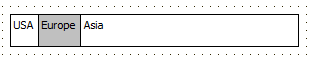
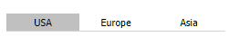
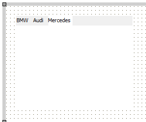
Below is a list of the most important properties methods and events for TWebTabSet. TWebTabSet is similar to a VCL TTabSet.
 |
 |
|---|---|
| Designtime | Runtime |
| Property | Description |
|---|---|
| ElementClassName | Optionally sets the CSS classname for the label when styling via CSS is used |
| ElementID | Optionally sets the HTML element ID for a HTML element in the form HTML file the label needs to be connected with. When connected, no new label is created but the Delphi class is connected with the existing HTML element in the form HTML file |
| ItemIndex | Sets or gets the selected tab |
| Items | List of tab captions |
| SelectedColor | Sets the background color of the selected tab |
| Property | Description |
|---|---|
| Clear | Removes all tabs |
| SelectNextTab | Selects the next or previous page in the page control, depending on the value of the parameter. |
| Property | Description |
|---|---|
| OnClick | Event triggered when a tab is clicked |
| OnDblClick | Event triggered when a tab is clicked |
| OnSelectionChange | Event triggered when the selected tab changes |
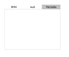
Below is a list of the most important properties methods and events for TWebPageControl. TWebPageControl is similar to a VCL TPageControl.
 |
 |
|---|---|
| Designtime | Runtime |
| Property | Description |
|---|---|
| ElementClassName | Optionally sets the CSS classname for the label when styling via CSS is used |
| ElementID | Optionally sets the HTML element ID for a HTML element in the form HTML file the label needs to be connected with. When connected, no new label is created but the Delphi class is connected with the existing HTML element in the form HTML file |
| SelectedColor | Sets the background color of the selected tab |
| TabIndex | Sets or gets the selected page index |
| Property | Description |
|---|---|
| SelectNextPage | Selects the next or previous page in the page control, depending on the value of the parameter. |
| Property | Description |
|---|---|
| OnChange | Event triggered when the active page of the page control changes |
| OnClick | Event triggered when the page is clicked |
| OnDblClick | Event triggered when the page is double-clicked |
Below is a list of the most important properties methods and events for TWebSpeedButton. TWebSpeedButton is similar to a VCL TSpeedButton.
 |
 |
|---|---|
| Designtime | Runtime |
| Property | Description |
|---|---|
| AllowAllUp | When there is a group of speed buttons, depending on AllowAllUp, there is always a button down or not |
| Caption | Sets the speedbutton text |
| ElementClassName | Optionally sets the CSS classname for the label when styling via CSS is used |
| ElementID | Optionally sets the HTML element ID for a HTML element in the form HTML file the label needs to be connected with. When connected, no new label is created but the Delphi class is connected with the existing HTML element in the form HTML file |
| Enabled | Sets the button as enabled or disabled |
| Flat | When true, the button is displayed in flat style Glyph Sets the image for the speed but |
| Glyph | Sets the image for the speed button |
| GroupIndex | To group buttons, set the GroupIndex indentical for multiple speed buttons |
| MaterialGlyph | Allows to pick an icon from the Google material icon set<img src=“..png” |
| Property | Description |
|---|---|
| OnClick | Event triggered when the speed button is clicked |
| OnDblClick | Event triggered when the speed button is double-clicked |
Below is a list of the most important properties methods and events for TWebToolBar. A TWebToolBar is a container control that can host several controls to form a toolbar.
 |
 |
|---|---|
| Designtime | Runtime |
| Property | Description |
|---|---|
| ElementClassName | Optionally sets the CSS classname for the label when styling via CSS is used |
| ElementID | Optionally sets the HTML element ID for a HTML element in the form HTML file the label needs to be connected with. When connected, no new label is created but the Delphi class is connected with the existing HTML element in the form HTML file |
| Property | Description |
|---|---|
| OnClick | Event triggered when the toolbar is clicked |
| OnDblClick | Event triggered when the toolbar is double-clicked |
Below is a list of the most important properties methods and events for TWebRichEditToolbar.
 |
 |
|---|---|
| Designtime | Runtime |
| Property | Description |
|---|---|
| ElementClassName | Optionally sets the CSS classname for the label when styling via CSS is used |
| ElementID | Optionally sets the HTML element ID for a HTML element in the form HTML file the label needs to be connected with. When connected, no new label is created but the Delphi class is connected with the existing HTML element in the form HTML file |
| Hints | Contains the list of hint property vaues for the buttons in the ribbon |
| RichEdit | Sets the TWebRichEdit component with which the toolbar interacts |
| VisibleButtons | Sets the TWebRichEdit component with which the toolbar interacts |
| Property | Description |
|---|---|
| OnClick | Event triggered when the toolbar is clicked |
| OnDblClick | Event triggered when the toolbar is double-clicked |
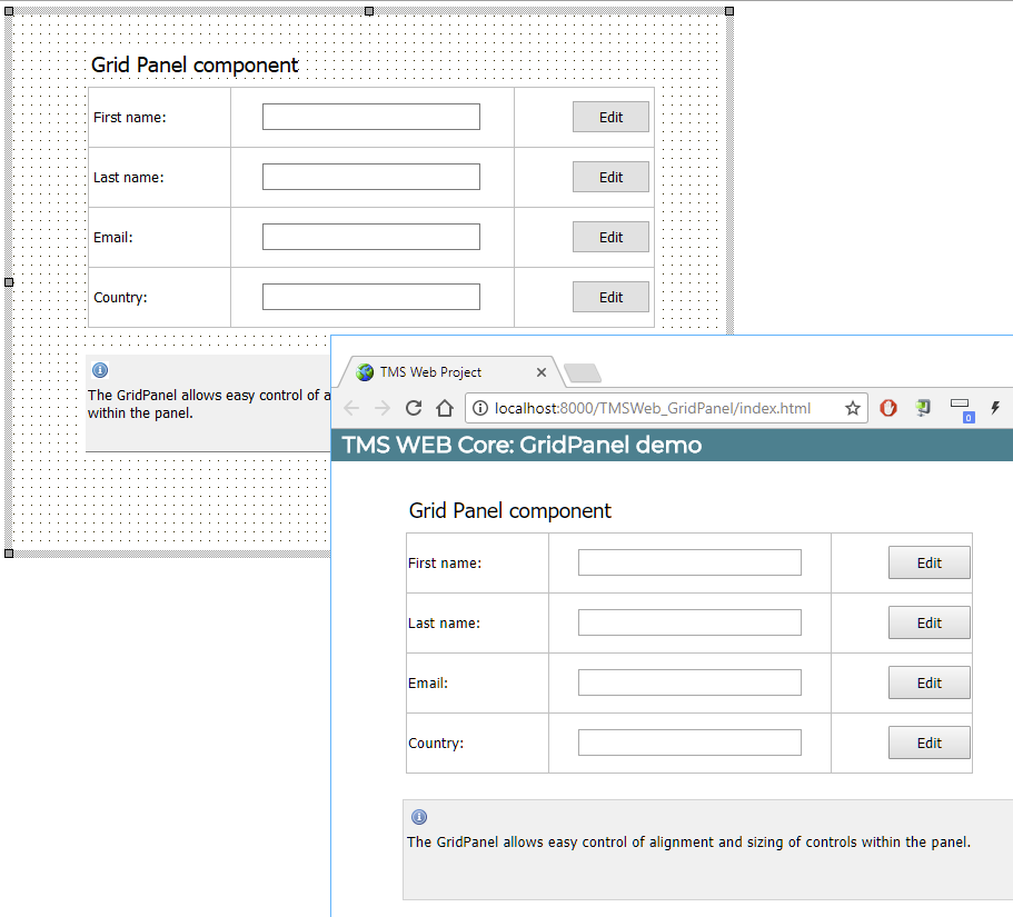
Below is a list of the most important properties methods and events for TWebGridPanel.
 |
 |
|---|---|
| Designtime | Runtime |
| Property | Description |
|---|---|
| ColumnCollection | Access to the collection of columns in the grid panel. The width, alignment, CSS, width style of each column can be specified Alignment: sets the vertical alignment in the row to taLeftJustify, taCenter, taRightJustify ElementClassName: sets an optional CSS class name for the column MarginLeft: sets a left margin in pixels MarginRight: sets a right margin in pixels SizeStyle: sets the style of the width specification as percent, absolute, auto Value: sets the width value |
| ElementClassName | Optionally sets the CSS classname for the label when styling via CSS is used |
| ElementID | Optionally sets the HTML element ID for a HTML element in the form HTML file the label needs to be connected with. When connected, no new label is created but the Delphi class is connected with the existing HTML element in the form HTML file |
| ExpandStyle | Can be set to esAddRows: new rows are added when new controls are inserted an no more grid cells are available esAddColumns: new columns are added when new controls are inserted an no more grid cells are available |
| GridLineColor | Sets the color of the grid lines |
| GridLineWidth | Sets the width of the grid lines |
| RowCollection | Access to the collection of rows in the grid panel. The height, alignment, CSS, height style of each row can be specified Alignment: sets the vertical alignment in the row to vaTop, vaCenter, vaBottom ElementClassName: sets an optional CSS class name for the row MarginBottom: sets a bottom margin in pixels MarginTop: sets a top margin in pixels SizeStyle: sets the style of the height specification as percent, absolute, auto Value: sets the height value |
| Property | Description |
|---|---|
| OnClick | Event triggered when the panel is clicked |
| OnClick | Event triggered when the panel is double-clicked |
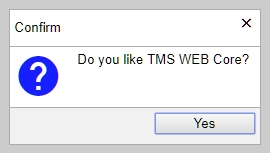
Below is a list of the most important properties methods and events for TWebMessageDlg. This component allows to display modal dialogs (simulated by disabling all controls on the page as the concept of modal dialogs does not exist in web applications).
Result for the following code:
WebMessageDlg1.ShowDialog('Do you like TMS WEB Core?',WEBLib.Dialogs.mtConfirmation, [mbYes]);
 |
 |
|---|---|
| Designtime | Runtime |
| Property | Description |
|---|---|
| DialogResult: TModalResult | Holds the result of calling the dialog |
| ElementClassName | Optionally sets the CSS classname for the label when styling via CSS is used |
| ElementID | Optionally sets the HTML element ID for a HTML element in the form HTML file the label needs to be connected with. When connected, no new label is created but the Delphi class is connected with the existing HTML element in the form HTML file |
| Property | Description |
|---|---|
| ShowDialog(Msg: string; DlgType: TMsgDlgType; Buttons: TMsgDlgButtons; AProc: TDialogResultProc = nil); | Method to show the message. The last parameter is a method pointer for a method that is optionally called when assigned when the dialog is closed |
| Property | Description |
|---|---|
| OnButtonClick | Event triggered when a button on the message dialog is clicked |
| OnClose | Event triggered when the messagebox is closed |
Below is a list of the most important properties methods and events for TWebToggleButton.
 |
 |
|---|---|
| Designtime | Runtime |
| Property | Description |
|---|---|
| Checked | Sets or gets the state of the toggle button |
| Style | Style of the toggle button can be tsRectangular or tsRounded |
| Property | Description |
|---|---|
| OnClick | Event triggered the toggle button is clicked |
Below is a list of the most important properties methods and events for TWebBitBtn.
 |
 |
|---|---|
| Designtime | Runtime |
| Property | Description |
|---|---|
| Caption | Sets the caption for the button |
| Flat | When true, the button is displayed in flat style |
| Glyph | Sets the optional image for the button |
| Layout | Sets the position of the button image versus the button caption blGlyphLeft: glyph left from caption blGlyphRight: glyph right from caption blGlyphTop: glyph on top of caption blGlyphBottom: glyph under caption |
| MaterialGlyph | Allows to pick an icon from the Google material icon set<img src=“.12.png” |
| Property | Description |
|---|---|
| OnClick | Event triggered when the button is clicked |
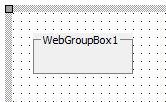
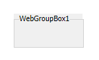
Below is a list of the most important properties methods and events for TWebGroupBox. The TWebGroupBox is a container control with a caption
 |
 |
|---|---|
| Designtime | Runtime |
| Property | Description |
|---|---|
| ElementClassName | Optionally sets the CSS classname for the label when styling via CSS is used |
| ElementID | Optionally sets the HTML element ID for a HTML element in the form HTML file the label needs to be connected with. When connected, no new label is created but the Delphi class is connected with the existing HTML element in the form HTML file |
| Property | Description |
|---|---|
| OnClick | Event triggered when the groupbox is clicked |
| OnDblClick | Event triggered when the groupbox is double-clicked |
Below is a list of the most important properties methods and events for TWebStretchPanel. The TWebStretchPanel is a container control with a top and bottom area. The height of the bottom area has a fixed height while the top area height can adapt itself to the height of controls (when controls are relatively positioned in the top area). When a control is put in the upper area at design-time, it will belong at runtime in the upper stretching area of the TWebStretchPanel. When a control is put in the lower area, it will belong to the lower fixed height area and will as such automatically appear lower when the upper panel area is stretched to fit the controls in the upper area.
|
|
|---|
Example: A TWebListBox and TWebButton is placed on the TWebStretchPanel. The button is on the lower part, the listbox on the upper part. From the button, items are added to the listbox and the height of the listbox is increased. This causes the upper part to stretch to the height of the listbox and the button remains below the stretched upper area in the fixed height area of the lower part:
procedure TSampleForm.WebButton1Click(Sender: TObject);
var
i: integer;
begin
for i := 0 to 20 do
begin
WebListbox1.Items.Add('item '+inttostr(i));
end;
WebListbox1.Height := 300;
end;
|ElementClassName|Optionally sets the CSS classname for the label when styling via CSS is used| |ElementID|Optionally sets the HTML element ID for a HTML element in the form HTML file the label needs to be connected with. When connected, no new label is created but the Delphi class is connected with the existing HTML element in the form HTML file| |FixedHeight|Sets the fixed height of the bottom area in the panel.|
|OnClick|Event triggered when the groupbox is clicked| |OnDblClick|Event triggered when the groupbox is double-clicked| |OnMouseDown|Event triggered when the mouse is down on the panel| |OnMouseMove|Event triggered when the mouse moves over the panel| |OnMouseUp|Event triggered when the mouse goes up on the panel|
Below is a list of the most important properties methods and events for TWebStringGrid. TWebStringGrid is similar to a VCL TStringGrid.
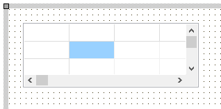 |
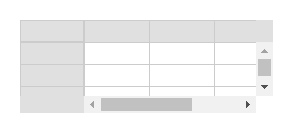 |
|---|---|
| Designtime | Runtime |
Set or get the content of grid cells via:
Grid.Cells[col,row]: string;

Set or get the column width in the grid via

Grid.ColWidths[col]: integer;

Set or get the row height in the grid via

Grid.RowHeights[row]: integer
| Property | Description |
|---|---|
| BorderStyle | Selects the border style of the grid |
| ColCount | Sets the number of columns in the grid |
| DefaultColWidth | Sets the default column width |
| DefaultRowHeight | Sets the default row height |
| FixedColor | Sets the color of fixed cells |
| FixedCols | Sets the number of fixed columns in the grid |
| FixedRows | Gets or sets the index of the first normal grid column displaying. Use this property to get or set the horizontal scroll position |
| LeftCol | |
| Options | The settings that are supported are: goEditing: enables editing in the grid goHorzLine: enables horizontal grid lines goVertLine: enables vertical grid lines goRowSelect: enables row selection |
| RowCount | Sets the number of rows in the grid |
| Selection | Gets or selects the range of selected cells in the grid. Selection is of the type TGridRect |
| TopRow | Gets or sets the index of the first normal grid row displaying. Use this property to get or set the vertical scroll position |
| Property | Description |
|---|---|
| OnClick | Event triggered when grid is clicked |
| OnDblClick | Event triggered when grid is double-clicked |
| OnGetEditText | Event triggered when a cell goes to edit mode requesting the value to be edited |
| OnGetEditText | Event triggered when an error occurred with the HTTP GET request used to get data via methods LoadFromJSON()/LoadFromCSV() |
| OnHttpRequestSuccess | Event triggered when the HTTP GET request used to get data via methods LoadFromJSON()/LoadFromCSV() successfully returned |
| OnSetEditText | Event triggered when a cell goes out of edit mode returned the edited value |
Below is a list of the most important properties methods and events for TWebListControl. TWebListControl represents a HTML <UL> list structure. The TWebListControl is also especially designed to be able to use Bootstrap CSS styles for effects like banding, hovering,… and much more. Find more information about Bootstrap list styles at: https://getbootstrap.com/docs/4.0/components/list-group
In this example, the ElementListClassName was set to: “list-group” and the ItemClassName was set to: “list-group-item d-flex justify-content-between align-items-center list-group-item-action”
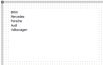 |
 |
|---|---|
| Designtime | Runtime |
Items are added to the list via the Items collection. The Item class is defined as:
| Property | Description |
|---|---|
| Active | When true, the item is shown as active item in the list (when the CSS defines the Active style) |
| AutoCollaps | When true, the item click will collapse / uncollapse the sub items (when the CSS defines the Collapse style) |
| Enabled | When true, the item is enabled and can be clicked and will trigger the OnItemClick event |
| ItemClassName | Optionally sets the CSS classname for the item when styling via CSS is used |
| Items | Collection of sub items for an item. The sub items collection is exactly the same as the main items collection. Note that items in sub items can also have sub items etc.. |
| Link | Sets the optional URL for the item text when it needs to be clickable with an URL reference |
| LinkClassName | Optionally sets the CSS classname for the item link when styling via CSS is used |
| Tag | Integer tag property associated with the item |
| Text | Text of the item |
| Property | Description |
|---|---|
| DefaultItemClassName | Sets the CSS class that is automatically applied to an item ItemClassName when a new item is created. The DefaultItemClassName is only used upon creation of new TLinkItem instances |
| DefaultItemLinkClassName | Sets the CSS class that is automatically applied to an item LinkClassName when a new item is created. The DefaultLinkClassName is only used upon creation of new TLinkItem instances |
| ElementClassName | Optionally sets the CSS classname for the label when styling via CSS is used |
| ElementID | Optionally sets the HTML element ID for a HTML element in the form HTML file the label needs to be connected with. When connected, no new label is created but the Delphi class is connected with the existing HTML element in the form HTML file |
| ElementListClassName | Optionally sets the CSS classname for the list when styling via CSS is used |
| Items | Collection of TListItem instances and possibly sub items making up the list |
| Style | When Style is set, this presets the CSS DefaultItemClassName, DefaultItemLinkClassName, ElementListClassName to match popular Bootstrap list styles. Sets the style of the list to: lsBreadCrumb: list of items makes up a breadcrumb lsListGroup: vertical list of items lsPagination: list makes up items of a paging control, like a control to select a page of rows to show in a grid lsTabs: list makes up items of tab group |
| Event | Description |
|---|---|
| OnGetItemChildren | Event triggered when the list item is rendered allowing to insert child HTML elements in the list element |
| OnGetItemClass | Event triggered when the list item is rendered allowing to customize the CSS class of the list element |
| OnItemClick | Event triggered when a list item is clicked |
| OnItemDblClick | Event triggered when a list item is double-clicked |
Below is a list of the most important properties methods and events for TWebTableControl. TWebTableControl represents a HTML table. The HTML table can have a header row and/or header column. The TWebTableControl is also especially designed to be able to use Bootstrap CSS styles for effects like banding, hovering,… Find more information about Bootstrap table styles at: https://getbootstrap.com/docs/4.0/content/tables/
In this example, the ElementHeaderClassName was set to:table thead-dark” and the ElementTableClassName was set to: “table table-hover table-bordered table-striped table-sm”
 |
 |
|---|---|
| Designtime | Runtime |
Set or get the content of table cells via:
TableControl.Cells[col,row]: string;

Set or get the HTML table cell elements in the grid via:

TableControl.CellElements[col,row]: TJSElement

Set or get the CSS class name for a row in the table via:

TableControl.RowClassName[row]: string;
| Property | Description |
|---|---|
| ColCount | Sets the number of columns in the table |
| ColHeader | When true, a row header column is shown |
| ElementClassName | Optionally sets the CSS classname for the label when styling via CSS is used |
| ElementID | Optionally sets the HTML element ID for a HTML element in the form HTML file the label needs to be connected with. When connected, no new label is created but the Delphi class is connected with the existing HTML element in the form HTML file |
| ElementTableClassName | Optionally sets the CSS classname for the label when styling via CSS is used |
| RowCount | Sets the number of rows in the table |
| RowHeader | When true, a column header row is shown |
| Property | Description |
|---|---|
| LoadFromJSON(const AURL: string; ADataNode: string); | Load JSON formatted data found a AURL via a HTTP GET in the string grid. The expected data is a JSON array. When the ADataNode parameter is different from empty, it tries to fetch the JSON array from the ADataNode JSON node. |
| LoadFromJSON(const AURL: string; ADataNode: string); | Load CSV formatted data found a AURL via a HTTP GET in the table contro. Optional parameters are the delimiter to use to parse the CSV file and when the LoadFixed parameter is true, the CSV data is also loaded in the fixed cells of the table control. |
| Property | Description |
|---|---|
| OnClick | Event triggered when the table is clicked |
| OnClickCell | Event triggered when a table cell is clicked |
| OnDblClick | Event triggered when the table is double-clicked |
| OnDblClickCell | Event triggered when the table is double-clicked |
| OnHttpRequestError | Event triggered when an error occurred with the HTTP GET request used to get data via methods LoadFromJSON()/LoadFromCSV() |
| OnHttpRequestSuccess | Event triggered when the HTTP GET request used to get data via methods LoadFromJSON()/LoadFromCSV() successfully returned |
Below is a list of the most important properties methods and events for TWebResponsiveGrid. TWebResponsiveGrid represents a HTML table structure with a responsive behavior of configuration of columns and rows in relationship to the screen size the control is rendered on.
|
|
|---|---|
| Designtime | Runtime |
The TWebResponsiveGrid renders items from its Items collection in columns and rows. The number of columns and rows can dynamically adapt to the size of the screen on which the control is rendered. To add items to TWebResponsiveGrid, use the Items collection and set the HTML content for each item via WebResponsiveGrid.Items[index].HTML: string; For each item, there is also a Tag: integer property and ItemObject: TObject property for setting information associated with the item. The HTML element in the grid via which the item is rendered is also accessible via public property WebResponsiveGrid.Items[index].ElementHandle: TJSHTMLElement.
| Property | Description |
|---|---|
| ItemBorderColor | Sets the border color of an item in normal state |
| ItemClassName | Sets the CSS class name for an item |
| ItemColor | Sets the background color of an item in normal state |
| ItemGap | Sets the gap (horizontally and vertically) in pixels between items in the grid |
| ItemHeight | Sets the height of an item in pixels |
| ItemHoverBorderColor | Sets the border color of an item in hovered state |
| ItemHoverColor | Sets the background color of an item in hovered state |
| ItemPadding | Sets the padding internally in an item in pixels |
| ItemSelectedBorderColor | Sets the border color of an item in selected state |
| ItemSelectedColor | Sets the background color of an item in selected state |
| ItemSelectedTextColor | Sets the text color of an item in selected state |
| ItemTemplate | Sets an optional HTML template to be usedwhen data for the responsive grid is dynamically loaded from CSV or JSON. Use (%FIELDNAME%) place-holders in the HTML template to define which data should be used in what parts of the HTML for the item. |
| ItemMinWidth | Sets the minimum width of an item in pixels. This will determine the number of columns that can be rendered in the grid. |
| ScrollVertical | When true, a vertical scrollbar will be used when the number of items exceeds the |
| height of the control. Otherwise, the height will automatically increase to enable to display of all items in the list. |
| Property | Description |
|---|---|
| LoadFromJSON(const AURL: string; ADataNode: string); | Load JSON formatted data found a AURL via a HTTP GET in the string grid. The expected data is a JSON array. When the ADataNode parameter is different from empty, it tries to fetch the JSON array from the ADataNode JSON node. |
| LoadFromCSV(const AURL: string;Delimiter: char = ‘;’; LoadFixed: Boolean = false) | Load CSV formatted data found a AURL via a HTTP GET in the table contro. Optional parameters are the delimiter to use to parse the CSV file and when the LoadFixed parameter is true, the CSV data is also loaded in the fixed cells of the table control. |
| Property | Description |
|---|---|
| OnClick | Event triggered when the grid is clicked |
| OnDblClick | Event triggered when the grid is double-clicked |
| OnHttpRequestError | Event triggered when there is a HTTP errorrelated to loading data from CSV or JSON. |
| OnGetCellChildren | Event triggered when a new cell is rendered during loading date from CSV or JSON in the grid. Passes the HTML element for the grid cell allowing to insert dynamically HTML child elements in the cell |
| OnGetCellClass | Event triggered when a new cell is rendered during loading date from CSV or JSON in the grid. Allows to set the CSS class name for an individual cell allowing customization this way. |
| OnGetCellData | Event triggered when a new cell is rendered during loading date from CSV or JSON in the grid. Allows to dynamically override or customize the values retrieved from the CSV or JSON (or dataset in case of a TWebDBGrid) |
| OnHttpRequestError | Event triggered when an error occurred with the109 HTTP GET request used to get data via methods |
| LoadFromJSON()/LoadFromCSV() | |
| OnHttpRequestSuccess | Event triggered when the HTTP GET request used to get data via methods |
| LoadFromJSON()/LoadFromCSV() successfully returned | |
| OnItemClick | Event triggered when an item in the grid is clicked |
| OnItemCreated | Event triggered when an item in the grid is created as a result of loading data from a CSV file or JSON file. The Item can be accessed via WebResponsiveGrid.Items[index] and the HTML element in which the item is rendered via WebResponsiveGrid.Items[index].ElementHandle: TJSHTMLElement |
| OnItemDblClick | Event triggered when an item in the grid is double-clicked |
| OnItemGetFieldValue | Event triggered when a value from a CSV column or JSON field is going to be replaced in the HTML template and via this event, the data can be dynamically customized. |
Below is a list of the most important properties methods and events for TWebLoginPanel
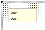 |
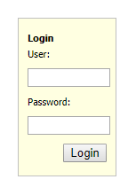 |
|---|---|
| Designtime | Runtime |
| Property | Description |
|---|---|
| ElementButtonClassName | Optionally sets the CSS classname for the label when styling via CSS is used |
| ElementCaptionClassName | Optionally sets the CSS classname for the label when styling via CSS is used |
| ElementClassName | Optionally sets the CSS classname for the label when styling via CSS is used |
| ElementClassName | Optionally sets the CSS classname for the label when styling via CSS is used |
| ElementInputClassName | Optionally sets the CSS classname for the label when styling via CSS is used |
| ElementLabelClassName | Optionally sets the CSS classname for the label when styling via CSS is used |
| Padding | Sets the padding inside the login panel |
| Password | Gets or sets the value of the password INPUT control |
| PasswordLabel | Gets or sets the value of the password INPUT control |
| User | Gets or sets the value of the username INPUT control |
| Userlabel | Sets the caption text for the label in front of the username INPUT control |
| Property | Description |
|---|---|
| OnLogin | Event triggered when the login button is clicked |
Below is a list of the most important properties methods and events for TWebGoogleMaps.
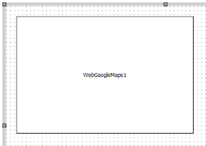 |
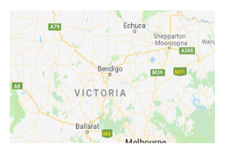 |
|---|---|
| Designtime | Runtime |
| Property | Description |
|---|---|
| APIkey | Sets the Google Maps JavaScript APIKEY |
| ElementClassName | Optionally sets the CSS classname for the label when styling via CSS is used |
| ElementID | Optionally sets the HTML element ID for a HTML element in the form HTML file the label needs to be connected with. When connected, no new label is created but the Delphi class is connected with the existing HTML element in the form HTML file |
| Property | Description |
|---|---|
| SetCenter(Lat, Lon: double); | Centers the map around geocoordinate Lat/Lon |
| SetZoom(zoom: integer); | Controls the map zoom level (between 1 and 1) |
| AddMarker(Lat,Lon: double; Title: string = ’’); | Adds a marker with optional title at geocoordiate Lat/Lon |
| ClearMarkers | Removes all markers on the map |
| ShowDirections(Source, Destinations: string); | Show the calculated route between Source and Destination expressed as addresses |
| RemoveDirections | Removes the display of a route on the map |
| GeoCode(const Address: string); | Converts the address to the geocoordinate Lat/Lon. The result of the conversion is retrieved via the event OnGeoCoded |
| Property | Description |
|---|---|
| OnGeoCoded | Event triggered when the geocoding started with WebGoogleMaps.GeoCode() was successful |
| OnMapClick | Event triggered when the map is clicked |
| OnMapDblClick | Event triggered when the map is double-clicked |
| OnMapPan | Event triggered when the map is panned |
| OnMapZoom | Event triggered when the map is zoomed |
Below is a list of the most important properties methods and events for TWebYoutube.
 |
 |
|---|---|
| Designtime | Runtime |
| Property | Description |
|---|---|
| AllowFullScreen | When true, the button to show the video in full screen is displayed |
| AutoPlay | When true, the video starts playing as soon as the page opens |
| ElementClassName | Optionally sets the CSS classname for the label when styling via CSS is used |
| ElementID | Optionally sets the HTML element ID for a HTML element in the form HTML file the label needs to be connected with. When connected, no new label is created but the Delphi class is connected with the existing HTML element in the form HTML file |
| VideoID | Sets the Youtube ID of the video |
Below is a list of the most important properties methods and events for TWebTwitterFeed. TWebTwitterFeed is an easy way to display a Twitter feed in a page. The Twitter feed displays as soon as the Feed (Twitter ID) is set.
 |
 |
|---|---|
| Designtime | Runtime |
| Property | Description |
|---|---|
| ElementClassName | Optionally sets the CSS classname for the label when styling via CSS is used |
| ElementID | Optionally sets the HTML element ID for a HTML element in the form HTML file the label needs to be connected with. When connected, no new label is created but the Delphi class is connected with the existing HTML element in the form HTML file |
| Feed | Sets the id of the Twitter feed to display |
| FeedLinkText | Sets additional text displayed together with the feed items |
TMS WEB Core offers the concept of a dataset and datasource. Via a dataset and a datasource, UI controls can be directly connected to a dataset, avoiding to write any code to show data and update data. Databinding works similar as in VCL application. A DB-aware control has a DataSource property that is connected to a non-visual datasource component (TWebDataSource). The TWebDataSource is in turn connected to a dataset, for example the TWebClientDataSet. Other than the DataSource property, the DB-aware control uses the FieldName property to select the DB field with which to connect the DB-aware control. The non-visual datasource and dataset components can be placed directly on the form, or even better, on a TWebDataModule.
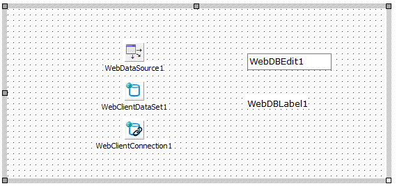
This is a DB-aware label. The label connects typically to a DB string field and shows the content of the DB string field as label on the form.
The TWebDBLabel is connected via DataSource and FieldName properties to a dataset.
This is a DB-aware edit control. The edit control connects typically to a DB string field and allows to edit the content of the DB string field via an edit control on the form.
The TWebDBEdit is connected via DataSource and FieldName properties to a dataset.
This is a DB-aware checkbox control. The checkbox control connects typically to a DB boolean field and allows to edit the content of the DB Boolean field via a checkbox control on the form.
The TWebDBCheckBox is connected via DataSource and FieldName properties to a dataset.
This is a DB-aware spin edit control. The spin edit control connects typically to a DB numeric field and allows to edit the content of the DB numeric field via a spin edit control on the form.
The TWebDBSpinEdit is connected via DataSource and FieldName properties to a dataset.
This is a DB-aware memo control. The memo control connects typically to a DB text blob field and allows to edit the content of the DB text blob field via a memo control on the form.
The TWebDBMemo is connected via DataSource and FieldName properties to a dataset.
This is a DB-aware date or time picker control. The date or time picker control connects typically to a DB date or time field and allows to edit the content of the DB date or time field via a date or time picker control on the form.
The TWebDBDatePicker is connected via DataSource and FieldName properties to a dataset.
This is a DB-aware radiogroup control. The radiogroup control connects typically to a DB integer field and allows to edit the content of the DB integer field via a group box control on the form.
The TWebDBRadioGroup is connected via DataSource and FieldName properties to a dataset.
This is a DB-aware link label control. The link label control connects typically to a DB string field and allows to show the content of the DB string field via a label with link on the form.
The TWebDBLinkLabel is connected via DataSource and FieldName properties to a dataset.
This is a DB-aware image control. The image control connects typically to a DB string field and allows to show the content of the DB string field as an image referring to the URL in the DB string field value.
The TWebDBImageControl is connected via DataSource and FieldName properties to a dataset.
For setting generating the proper image URL from the DB field value, two additional capabilities are offered.
| Property | Description |
|---|---|
| BaseURL | Sets the optional URL prefix. In case the DB field only contains the image filename, BaseURL can be set to the full HTTP(S) URL specifier |
| OnSetURL | This event is triggered with a var parameter AURL that can be used to transform the DB field value to the required full HTTP(S) URL |
This is a DB-aware table control. A table control column connects typically to a DB field and allows to show the content of the DB field in a column of the table.
The column in the TWebDBTableControl.Columns collection has following properties:
| Property | Description |
|---|---|
| DataField | Sets the DB field that should be displayed in the column |
| DataType | Defines whether the DB field connected to the column should be displayed as text, an image or a hyperlink |
| Title | Sets the column header text |
This is a DB-aware responsive list control. A responsive list control column connects typically to a DB field and allows to show the content of the DB fields in a list item via a template.
The template configures the HTML to be displayed in a responsive list item. The template is set via TWebDBResponsiveGrid.Options.ItemTemplate.
To include a DB field value in the item, specify in the template the DB field as: (%FIELDNAME%)
Example:
When connecting the FishFact JSON dataset to the responsive list and setting the template in the following way:
TWebDBResponsiveGrid.Options.ItemTemplate := ‘<strong>(%_Common_Name%)</strong>(%_Species_Name%)<IMG width="9px" src="(%_Graphic%)">';
The result is that from the dataset, the _Common_Name, _Species_Name field are shown and the _Graphic field image URL is used to show the image with a width of 9 pixels:
This is a DB-aware grid. A grid column connects typically to a DB field and allows to show the content of the DB field in a column of the grid.
The column in the TWebDBGrid.Columns collection has following properties:
| Property | Description |
|---|---|
| DataField | Sets the DB field that should be displayed in the column |
| DataType | Defines whether the DB field connected to the column should be displayed as text, an image or a hyperlink |
| ElementClassName | Sets an optional CSS class name for the cells of the column |
| Title | Sets the column header text |
| TitleElementClassName | Sets an optional CSS class name for the header cell of the column |
| Width | Sets the width of the column (in pixels) |
This is a DB-aware navigator, allowing to scroll in the connected dataset and perform operations as Edit, Post, Cancel on the dataset.
To use the TWebDBNavigator, drop it on the form and connect the datasource.
With the property VisibleButtons, set what buttons in the navigator need to be visible. The VisibleButtons property is a set property consisting of the following possible values:
nbFirst, nbPrior, nbNext, nbLast, nbInsert, nbDelete, nbEdit, nbPost, nbCancel
To customize the hint setting for each of the controls in the navigator, the TWebDBNavigator.Hints prorprty can be used.
TWebTimer is the direct equivalent of a VCL TTimer. It features an interval property with which the interval between two subsequent OnTimer events can be set in milliseconds. With the Enabled property the timer can be stopped or started. When the timer is enabled, it triggers the OnItem event every ‘interval’ milliseconds # TWebGeoLocation TWebGeoLocation wraps the browser capability to determine the geolocation of the device on which the browser runs. For privacy reasons, when an attempt to retrieve the geo location is performed, it will trigger a popup dialog requesting the authorization from the user to do so. With the method TWebGeoLocation.GetGeoLocation the request to get the geo location is started. When the geo location is retrieved, the OnGeoLocation event is triggered returning the longitude, latitude and altitude of the location.
procedure TForm1.WebGeoLocation1Geolocation(Sender: TObject; Lat, Lon,
Alt: Double);
begin
WebLabel1.Caption := Format('Device is at [%.4f:%.4f]', [Lon,Lat]);
end;
The TWebSocketClient is a non-visual component enabling to perform web socket communication with a websocket server. Set the hostname and port of the websocket server via WebSocketClient.HostName and Port. Start connecting to the websocket server via calling the method WebSocketClient1.Connect. When a successful connection is made, the WebSocketClient.OnConnect is triggered. Call WebSocketClient.Disconnect to disconnect form the server. When a disconnect is called programmatically or for another reason the connection to the websocket server is lost, the OnDisconnect event is triggered. Sending & retrieving data Data is sent as a string and retrieved as JavaScript object. To send a command call: WebSocketClient.Send(AMessage: string); When data is received from the websocket server, the event OnDataReceived is triggered. This returns the data as JavaScript. When the data is a string, the JavaScript obejct can be converted easily to a string by calling TJSObject.toString;
procedure TForm1.WebSocketClient1DataReceived(Sender: TObject; Origin:
string;
Data: TJSObject);
begin
WebListBox1.Items.Add(Data.toString);
end;
The TWebHttpRequest is a component to perform HTTP(s) requests to a server. The HTTP requests command can be: httpCUSTOM : a custom HTTP command set with WebHttpRequest.CustomCommand httpDELETE : a HTTP DELETE command httpGET : a HTTP GET command (default) httpHEAD : a HTTP HEAD command httpPOST : a HTTP POST command httpPUT : a HTTP PUT command Optionally, HTTP request headers can be set. The HTTP request headers are set via WebHttpRequest.Headers. This is a value/pair list of HTTP options. Default, the option CacheControl is set to no-cache.
When a HTTP POST command is execute, the POST data can be set via the WebHttpRequest.PostData property. Finally, the URL for performing the HTTP request is set via WebHttpRequest.URL: string; When the HTTP request is successful, the OnResponse event is triggered. When it fails, the event OnAbort is triggered. When the request is successful, the request response is returned as event parameter of the OnResponse event.
procedure TForm1.WebHttpRequest1Response(Sender: TObject; AResponse:
string);
begin
ShowMessage('server response:' + AResponse);
end;

´´´

When the response comes as JSON, the JSON parser with a similar interface as the standard
Delphi JSON parser can be used:
The following example shows how the response can be parsed as a JSON array:
procedure TForm1.WebHttpRequest1Response(Sender: TObject; AResponse: string); var JS: TJSON; JA: TJSONArray; JO: TJSONObject; i: integer; begin JS := TJSON.Create; JA := TJSONArray(JS.Parse(AResponse)); for i := 0 to JA.Count - 1 do begin JO := JA.Items[i]; WebListBox1.Items.Add(JO.Get(‘prop’)); end; end;```
TMS WEB Core includes wrapper for the jQWidgets jQuery controls. This UI control can be obtained from: www.jqwidgets.com To get started with the jQWidgets controls, it is important that the JavaScript and CSS libraries for these controls are added to the project. This is done by including the JavaScript libraries and CSS files to the main project HTML file. To get started, either open the main project HTML file from the Delphi IDE and add in the HTML file the script and CSS file references.
In the jQWidgets demo application, this is for example:
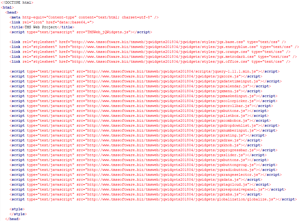
To make it easier for development and debugging, TMS WEB Core made a development version ready. To add jQWidgets UI control script references to your project, open the “Manage JavaScript libraries” menu item from the context menu in the Delphi IDE project manager and make sure to add first the jQuery .1.1 library reference followed by the jQWidgets development library. There is a reference for the jQWidgets core UI controls and an additional separate reference for the jQWidgets grid:
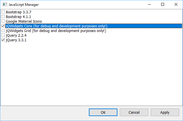
This adds the needed core jQWidgets library references to the project main HTML files. When you then add jQWidgets UI controls to the form, these controls will dynamically add their required additional jQuery files to the project HTML file.
Note that the jQWidgets library references added this way are for development purposes only! For a final release, it is required that you put the jQWidgets library files on your server and link to script files on your server!
Below is a list of the most important properties methods and events for TWebJQXButton. Represents a button with optional image.
 |
 |
|---|---|
| Designtime | Runtime |
| Property | Description |
|---|---|
| Caption | Sets the caption text of the button |
| CaptionPosition | Sets the position of the caption text |
| CaptionImageRelation | Sets the position of the image relative to the caption text |
| ElementClassName | Optionally sets the CSS classname when styling via CSS is used |
| ElementID | Optionally sets the HTML element ID for a HTML element in the form HTML file the label needs to be connected with. When connected, no new control is created but the Delphi class is connected with the existing HTML element in the form HTML file |
| ImageURL | Sets the URL of the image to be displayed in the button |
| ImagePosition | Sets the position of the image |
| ImageHeight | Sets the height of the image in pixels |
| ImageWidth | Sets the width of the image in pixels |
| RoundedBorders | Sets if the button is displayed with rounded borders |
| Template | Sets if the button is displayed with rounded borders |
| Theme | Sets the name of the theme that is used to display the control |
| Property | Description |
|---|---|
| OnClick | Event triggered when the button is clicked |
Below is a list of the most important properties methods and events for TWebJQXButtonGroup. Represents a group of buttons. The buttons can optionally behave like a radio group or checkbox group.
 |
 |
|---|---|
| Designtime | Runtime |
| Property | Description |
|---|---|
| ButtonSelect[Button: Integer] | Select or unselect a button based on the index in the Items list |
| EnableHover | Enables the visual effect when a button is hovered |
| Items | A list of button caption texts |
| Mode | Sets how the button group behaves. Options are: Default, CheckBox, RadioButton |
| Template | Sets the template used to display the control. Options are Default, Primary, Success, Warning, Danger, Info |
| Theme | Sets the name of the theme that is used to display the control |
| Property | Description |
|---|---|
| OnClick | Event triggered when a button is clicked |
Below is a list of the most important properties methods and events for TWebJQXCalendar. Represents a calendar that enables the user to select a date using a visual monthly calendar display.
 |
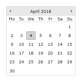 |
|---|---|
| Designtime | Runtime |
| Property | Description |
|---|---|
| Date | Sets the Calendar’s Date. If multiselect is True this is the first day of range of dates |
| ElementClassName | Optionally sets the CSS classname when styling via CSS is used |
| ElementID | Optionally sets the HTML element ID for a HTML element in the form HTML file the label needs to be connected with. When connected, no new control is created but the Delphi class is connected with the existing HTML element in the form HTML file |
| EndDate | Sets the last day of a range of dates. Only if MultiSelect is True |
| EndDate | Sets which day to display in the first day column |
| EndDate | Sets the maximum selectable date |
| MinDate | Sets the minimum selectable date |
| MultiSelect | If set to True a range of dates can be selected |
| OtherMonthDays | If set to True the days of days of the previous and next month are displayed |
| ShowToday | Sets if today’s day is highlighted |
| Theme | Sets the name of the theme that is used to display the control |
| WeekNumbers | Sets if the week numbers are displayed |
| Property | Description |
|---|---|
| OnDateClick | Event triggered when a date is selected |
| OnNavigateClick | Event triggered when the calendar is navigated to a different month |
Below is a list of the most important properties methods and events for TWebJQXColorPicker. A control that allows the user to easily pick a color.
 |
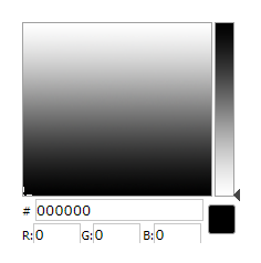 |
|---|---|
| Designtime | Runtime |
| Property | Description |
|---|---|
| Color | Sets the selected color |
| ColorMode | Sets the color mode to hue or saturation |
| ElementClassName | Optionally sets the CSS classname when styling via CSS is used |
| ElementID | Optionally sets the HTML element ID for a HTML element in the form HTML file the label needs to be connected with. When connected, no new control is created but the Delphi class is connected with the existing HTML element in the form HTML file |
| Property | Description |
|---|---|
| OnChange | Event triggered when a color is selected |
Below is a list of the most important properties methods and events for TWebJQXComboBox. A combobox control that contains an input field with auto-complete functionality and a list of selectable items displayed in a drop-down.
 |
 |
|---|---|
| Designtime | Runtime |
| Property | Description |
|---|---|
| AutoComplete | If set to True only the items that match the searched text are displayed in the list |
| ElementClassName | Optionally sets the CSS classname when styling via CSS is used |
| ElementID | Optionally sets the HTML element ID for a HTML element in the form HTML file the label needs to be connected with. When connected, no new control is created but the Delphi class is connected with the existing HTML element in the form HTML file |
| ItemIndex | Sets the selected item index |
| Items | The collection of items |
| MultiSelect | Sets if multiple items can be selected |
| Theme | Sets the name of the theme that is used to display the control |
| TextHint | Sets the text displayed before an item is selected |
| Property | Description |
|---|---|
| GetDisabled | Returns if the provided item index is disabled |
| SetDisabled | Sets the provided item index as disabled |
| GetSelected | Returns if the provided item index is selected |
| SetSelected | Sets the provided item index as selected |
| Property | Description |
|---|---|
| OnChange | Event triggered when an item is selected |
##Description
Below is a list of the most important properties methods and events for TWebJQXDateTimeInput. Represents a datetimeinput that enables the use to select a date or time using a popup calendar display or by keyboard input into the text field.
 |
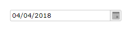 |
|---|---|
| Designtime | Runtime |
| Property | Description |
|---|---|
| Date | Sets the Calendar’s Date. If multiselect is True this is the first day of range of dates |
| ElementClassName | Optionally sets the CSS classname when styling via CSS is used |
| ElementID | Optionally sets the HTML element ID for a HTML element in the form HTML file the label needs to be connected with. When connected, no new control is created but the Delphi class is connected with the existing HTML element in the form HTML file |
| EndDate | Sets the last day of a range of dates. Only if MultiSelect is True |
| FirstDayOfWeek | Sets which day to display in the first day column |
| MaxDate | Sets the maximum selectable date |
| MinDate | Sets the minimum selectable date |
| MultiSelect | If set to True a range of dates can be selected |
| ShowToday | Sets if today’s day is highlighted |
| Theme | Sets the name of the theme that is used to display the control |
| WeekNumbers | Sets if the week numbers are displayed |
| Property | Description |
|---|---|
| OnDateClick | Event triggered when a date is selected |
Below is a list of the most important properties methods and events for TWebJQXDropDownList. Represents a control that contains a list of selectable items displayed in a drop-down.
 |
 |
|---|---|
| Designtime | Runtime |
| Property | Description |
|---|---|
| ElementClassName | Optionally sets the CSS classname when styling via CSS is used |
| ElementID | Optionally sets the HTML element ID for a HTML element in the form HTML file the label needs to be connected with. When connected, no new control is created but the Delphi class is connected with the existing HTML element in the form HTML file |
| ItemIndex | Sets the selected item index |
| Items | The collection of items |
| MultiSelect | Sets if multiple items can be selected |
| Theme | Sets the name of the theme that is used to display the control |
| TextHint | Sets the text displayed before an item is selected |
| Property | Description |
|---|---|
| OnChange | Event triggered when an item is selected |
Below is a list of the most important properties methods and events for TWebJQXGrid. The Grid is a powerful control that displays tabular data. It offers rich support for interacting with data, including paging, grouping, sorting filtering and editing.
 |
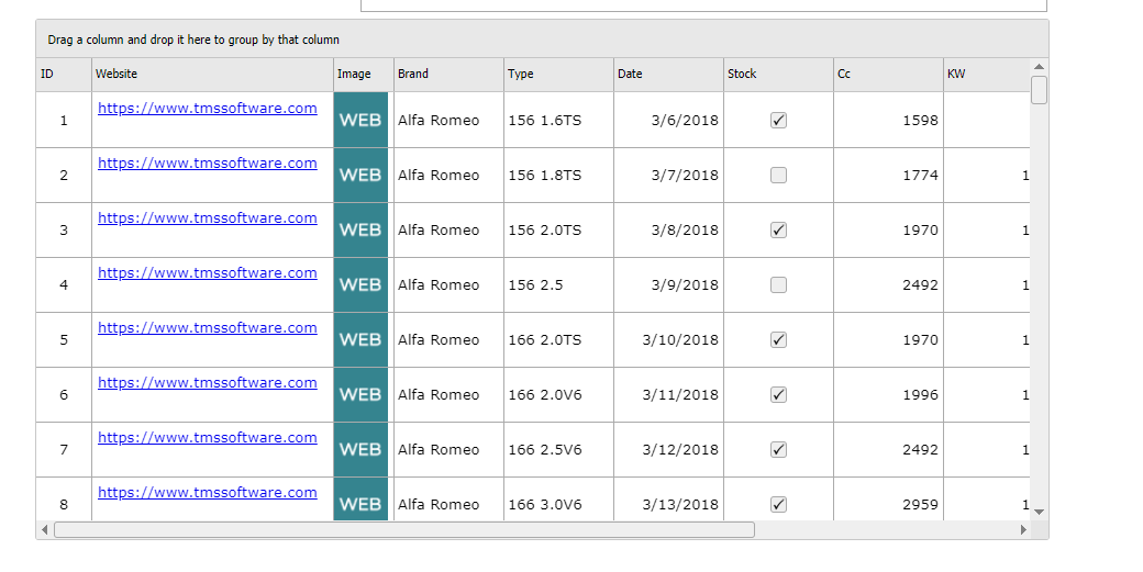 |
|---|---|
| Designtime | Runtime |
| Property | Description |
|---|---|
| Columns | |
| Alignment | Sets the text alignment in the column |
| ColumnType | Sets the type of the column. Default, Image (image URL displayed as an image), Email (email address displayed as hyperlink) or Link (URL displayed as hyperlink) |
| DataField | |
| DataType | Sets the datatype of the column. Available types are: Date, Double, Integer, String |
| Editor | Sets the editor for the column. Available editors are: CheckBox, DateTimeInput, DropDownList, Edit, None, NumberInput |
| Format | |
| Freeze | Sets if the column is fixed |
| Title | Sets the title of the column |
| Width | Sets the width in pixels of the column |
| Cells[Col, Row: Integer] | Gets or sets the value of a grid cell based on the column and row index |
| Data | |
|---|---|
| DataArray | If DataType is set to Array, assign a TJSArray with the data to load in the grid |
| DataType | Sets the type of data to load in the grid. Available types are: Array, CSV, JSON, None |
| Delimiter | Sets the delimiter character if DataType is set to CSV |
| Id | Sets the column name to be used as ID column if DataType is set to JSON |
| JSON | If DataType is set to JSON, assign the JSON data to load in the grid |
| Url | Assign the location of a CSV or JSON file to load the data in the grid if DataType is set to CSV or JSON respectively |
| RowSelect[Row: Integer] | Select a grid row based on the row index |
| FocusedCell | Gets or sets the currently focused cell |
| ElementClassName | Optionally sets the CSS classname when styling via CSS is used |
| ElementID | Optionally sets the HTML element ID for a HTML element in the form HTML file the label needs to be connected with. When connected, no new control is created but the Delphi class is connected with the existing HTML element in the form HTML file |
Options
| Band | |
|---|---|
| Enabled | Sets if row banding is enabled in the grid |
| RowCount | Sets the number of rows between banding rows |
| Editing | Sets if editing is enabled in the grid |
| Filtering | Sets if filtering is enabled in the grid |
| Grouping | Sets if grouping is enabled in the grid |
| Hovering | Sets if hovering is enabled in the grid |
| Paging | |
|---|---|
| Enabled | Sets if paging is enabled in the grid |
| PageSize | Sets the number of rows per page |
| SelectionMode | Sets the selection mode. Options are single row, single cell, multiple rows, multiple cells |
| Sorting | |
|---|---|
| ColumnIndex | Sets the column index the grid should be sorted by |
| Direction | Sets the sortdirection. Options are Ascending, Descending or Unsorted |
| Enabled | Sets if sorting is enabled |
| RowCount | Sets the number of displayed rows |
| RowHeight | Sets the height of a grid row |
| Theme | Sets the name of the theme that is used to display the control |
| Property | Description |
|---|---|
| SelectCell | Selects a single cell based on the provided row and column index |
| SelectRow | Selects a single row based on the provided row index |
| Property | Description |
|---|---|
| OnCellClick | Event triggered when a cell is clicked |
| OnCellEditClick | Event triggered when a cell is edited |
| OnCellEditDone | Event triggered after a cell is edited |
| OnCellEditStart | Event triggered when a cell is edited |
| OnCellEditValidate | Event triggered after a cell is edited |
| OnCellSelect | Event triggered when a cell is selected (via keyboard arrow keys) |
| OnFilter | Event triggered when the grid is filtered |
| OnGetCellData | Event triggered when a cell is rendered |
| OnPageChange | Event triggered when changing to a different page |
| OnRowClick | Event triggered when a row is clicked |
| OnRowSelect | Event triggered when a row is selected (via keyboard arrow keys) |
| OnSort | Event triggered when the grid is sorted |
Below is a list of the most important properties methods and events for TWebJQXKnob. Represents a control with a round shape which displays a draggable indicator within a range of values.
 |
 |
|---|---|
| Designtime | Runtime |
| Property | Description |
|---|
| Appearence | |
|---|---|
| BorderColor | Sets the border color of the control |
| BorderWidth | Sets the border width of the control |
| Color | Sets the background color of the control |
| Labels | |
|---|---|
| Offset | Sets the labels position offset in percentage |
| Step | Sets the step between labels |
| Visible | Sets if the labels are displayed |
| Marks | |
|---|---|
| BorderColorProgress | Sets the border color of the marks in the progress part |
| BorderColorRemaining | Sets the border color of the marks in the remaining part |
| ColorProgress | Sets the color of the marks in the progress part |
| ColorRemaining | Sets the color of the marks in the remaining part |
| MajorInterval | Sets the interval between major marks |
| MajorSize | Sets the size of the major marks |
| MarkType | Sets the type of marks displayed. Options are Line or Circle |
| MinorInterval | Sets the interval between minor marks |
| Offset | Sets marks position offset in percentage |
| Size | Sets the size of the marks |
| Width | Sets the width of the marks |
| Pointer | |
|---|---|
| BorderColor | Sets the border color of the pointer |
| Color | Sets the color of the pointer |
| Offset | Sets the pointer position offset in percentage |
| PointerType | Sets the type of pointer displayed. Options are Arrow, Circle, Line |
| Size | Sets the size of the pointer |
| Visible | Sets if the pointer is displayed |
| Width | Sets the width of the pointer |
| ProgressBar | |
|---|---|
| BackgroundColor | Sets the background color of the progressbar |
| BorderColor | Sets the border color of the progressbar |
| Color | Sets the color of the progressbar |
| Offset | Sets the progressbar offset position in percentage |
| Size | Sets the size of the progressbar |
| EndAngle | Sets the ending angle of the progressbar for the maximum value |
| Maximum | Sets the maximum value |
| Minimum | Sets the minimum value |
| StartAngle | Sets the starting angle of the progressbar for the minimum value |
| Step | Sets the step between values in the range |
| Value | Sets the default value |
| Property | Description |
|---|---|
| OnChange | Event triggered when the value is changed |
Below is a list of the most important properties methods and events for TWebJQXMaskedInput. Represents an input control which uses a mask to distinguish between proper and improper user input.
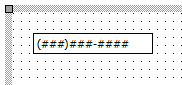 |
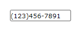 |
|---|---|
| Designtime | Runtime |
| Property | Description |
|---|---|
| ElementClassName | Optionally sets the CSS classname when styling via CSS is used |
| ElementID | Optionally sets the HTML element ID for a HTML element in the form HTML file the label needs to be connected with. When connected, no new control is created but the Delphi class is connected with the existing HTML element in the form HTML file |
| Mask | Sets the mask configuration. For an integer character from 0 to 9 A For an alpha numeric character from 0 to 9 and from A to Z L For an alpha character from A to Z |
| Text | Set the default text that is displayed |
| Theme | Sets the name of the theme that is used to display the control |
| Property | Description |
|---|---|
| OnChange | Event triggered when the value is changed |
Below is a list of the most important properties methods and events for TWebJQXMenu. Represents a menu control with support for sub-menus, it can be displayed vertical, horizontal or as a popup.
 |
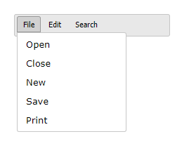 |
|---|---|
| Designtime | Runtime |
| Property | Description |
|---|---|
| ElementClassName | Optionally sets the CSS classname when styling via CSS is used |
| ElementID | Optionally sets the HTML element ID for a HTML element in the form HTML file the label needs to be connected with. When connected, no new control is created but the Delphi class is connected with the existing HTML element in the form HTML file |
| Menu | Set the TWebMainMenu control associated with the TWebJQXMenu |
| Mode | Set the display mode. Horizonal, Popup or Vertical |
| Theme | Sets the name of the theme that is used to display the control |
| Property | Description |
|---|---|
| OnItemClick | Event triggered when a menu item is clicked |
Below is a list of the most important properties methods and events for TWebJQXNumberInput. Represents a control that allows the user to input currency, percentages and any type of numeric data.
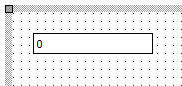 |
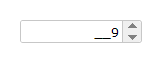 |
|---|---|
| Designtime | Runtime |
| Property | Description |
|---|---|
| DecimalDigits | Sets the number of available decimal digits |
| Digits | Sets the number of available digits |
| ElementClassName | |
| ElementID | Optionally sets the HTML element ID for a HTML element in the form HTML file the label needs to be connected with. When connected, no new control is created but the Delphi class is connected with the existing HTML element in the form HTML file |
| InputMode | Sets the input mode to Advanced (input with numeric mask) or Simple (restricted user input) |
| MaxValue | Sets the maximum allowed input value |
| MinValue | Sets the minimum allowed input value |
| ShowSpinButtons | Sets if the spin buttons are displayed |
| SpinButtonsStep | Sets the increase/decrease step |
| Symbol | Sets the character to use as currency or percentage symbol |
| SymbolPosition | Sets the position of the symbol. Left or Right |
| Theme | Sets the name of the theme that is used to display the control |
| Property | Description |
|---|---|
| OnChange | Event triggered when the input value is changed |
Below is a list of the most important properties methods and events for TWebJQXProgressBar. Represents a control that visually indicates the progress of an operation.
 |
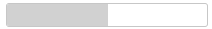 |
|---|---|
| Designtime | Runtime |
| Property | Description |
|---|---|
| AnimationDuration | Sets the duration of the animation to fill the progressbar to the value. Set to 0 to disable animation |
| Color | Sets the color of the progressbar up to the value set in the Stop property |
|---|---|
| Stop | Sets the end position for this color |
| ElementClassName | Optionally sets the CSS classname when styling via CSS is used |
| ElementID | Optionally sets the HTML element ID for a HTML element in the form HTML file the label needs to be connected with. When connected, no new control is created but the Delphi class is connected with the existing HTML element in the form HTML file |
| Maximum | Sets the maximum value |
| Minimum | Sets the minimum value |
| Orientation | Sets the progressbar orientation to Horizontal or Vertical |
| ShowValue | Sets if the value is displayed in the progressbar |
| Theme | Sets the name of the theme that is used to display the control |
| Value | Sets the value of the progress position |
Below is a list of the most important properties methods and events for TWebJQXRangeSelector. Represents a control that can be used to select a numeric range.
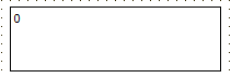 |
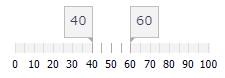 |
|---|---|
| Designtime | Runtime |
| Property | Description |
|---|---|
| Maximum | Sets the maximum value of the range |
| MaximumValue | Sets the end value of the selected range |
| Minimum | Sets the minimum value of the range |
| MinimumValue | Sets the start value of the selected range |
| MajorTicksInterval | Sets the interval between major ticks |
| MinorTicksInterval | Sets the interval between minor ticks |
| MoveOnClick | Sets if the range is moved left or right when the range selector is clicked |
| Resizable | Sets the if the initial range can be resized by dragging the thumbs |
| ShowMajorTicks | Sets if the major ticks are displayed |
| ShowMinorTicks | Sets if the minor ticks are displayed |
| ShowMarkers | Sets if the markers (thumbs) are displayed |
| Theme | Sets the name of the theme that is used to display the control |
| Property | Description |
|---|---|
| OnChange | Event triggered when the range is changed |
Below is a list of the most important properties methods and events for TWebJQXRating. Represents a control that allows to select a rating.
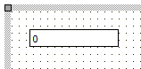 |
 |
|---|---|
| Designtime | Runtime |
| Property | Description |
|---|---|
| ElementClassName | Optionally sets the CSS classname when styling via CSS is used |
| ElementID | Optionally sets the HTML element ID for a HTML element in the form HTML file the label needs to be connected with. When connected, no new control is created but the Delphi class is connected with the existing HTML element in the form HTML file |
| ItemCount | Sets the number or rating items displayed |
| Value | Sets the default value |
| Property | Description |
|---|---|
| OnChange | Event triggered when the value is changed |
Below is a list of the most important properties methods and events for TWebJQXResponsivePanel. Represents a panel control with a responsive behaviour. The responsive panel collapses when the browser window (or parent element) width becomes less than a set value and the panel is then accessible by clicking a button.
 |
 |
|---|---|
| Designtime | Runtime |
| Property | Description |
|---|---|
| AnimationType | Sets the type of animation used when the panel is opened or closed. Options are Fade, Slide or None |
| AutoClose | Sets if the panel is automatically closed when a mouse click occurs outside the panel (only while the ToggleButton is visible) |
| CollapseBreakPoint | If the width of the browser window (or parent element) in pixels is lower than this value the ToggleButton is displayed, otherwise the ToggleButton is hidden |
| Theme | Sets the name of the theme that is used to display the control |
| ToggleButtonSize | Sets the size of the ToggleButton |
| Property | Description |
|---|---|
| Refresh | Performs a refresh of the control. If the width of the parent element has changed the ToggleButton is hidden or displayed based on the width of the parent element |
| Property | Description |
|---|---|
| OnClose | Event triggered when the panel is closed by clicking the ToggleButton |
| OnCollapse | Event triggered when the window (or parent element) width is higher than CollapseBreakPoint and the ToggleButton is hidden |
| OnExpand | Event triggered when the window (or parent element) width is lower than CollapseBreakPoint and the ToggleButton is displayed |
| OnOpen | Event triggered when the panel is opened by clicking the ToggleButton |
Below is a list of the most important properties methods and events for TWebJQXSlider. Represents a control that lets the user select from a range of values by moving a thumb along a track.
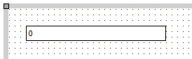 |
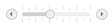 |
|---|---|
| Designtime | Runtime |
| Property | Description |
|---|---|
| ButtonsPosition | Sets the position of the buttons. Options are Both (Left and Right), Left, Right. Only available when ShowRangeSlider is False |
| Maximum | Sets the maximum value of the slider |
| MaximumValue | Sets the maximum selected value when ShowRangeSlider is True |
| Minimum | Sets the minimum value of the slider |
| MinimumValue | Sets the minimum selected value when ShowRangeSlider is True |
| MinorTicksFrequency | Sets the frequency of the minor ticks |
| MinorTicksSize | Sets the size of the minor ticks |
| Mode | Sets the mode of the slider. Options are Default or Fixed. If fixed the |
| ShowButtons | Sets if the buttons are displayed. Only available when ShowRangeSlider is False |
| ShowMinorTicks | Sets if the minor ticks are displayed along the slider |
| ShowRange | Sets if the slider range background is displayed |
| ShowRangeSlider | Sets if the slider is displayed as a range slider and has 2 thumbs. This allows to select a minimum and maximum value |
| ShowTicks | Sets if the ticks are displayed along the slider |
| Step | Set the slider’s increment and decrement step when the thumb is moved |
| Template | Sets the template used to display the control. Options are Default, Primary, Success, Warning, Danger, Info |
| Theme | Sets the name of the theme that is used to display the control |
| TickSize | Sets the size of the ticks |
| TicksPosition | Sets the position of the ticks. Options are Both (above and below the slider), Bottom or Top |
| Value | Sets the default value |
| Property | Description |
|---|---|
| OnChange | Event triggered when the value is changed |
Below is a list of the most important properties methods and events for TWebJQXTabs. TWebJQXTabs is similar to a VCL TPageControl.
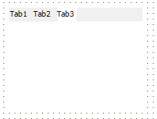 |
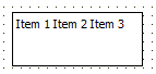 |
|---|---|
| Designtime | Runtime |
| Property | Description |
|---|---|
| Collapsible | Sets if the tab is collapsible by clicking the selected tab |
| EnableHover | Sets if a hover effect is displayed when hovering a tab with the mouse cursor |
| EnableScrollAnimation | Sets if animation is used when scrolling through the tabs |
| Position | Sets the position of the tabs row. Options are Top and Bottom |
| Reorder | Sets if the tabs can be reordered with drag and drop |
| ScrollPosition | Sets the position of the scrollbar arrows. Options are Left, Right and Both |
| ScrollStep | Sets the distance in pixels that is scrolled with the scroll arrows |
| SelectionTracker | Sets if an animated effect is displayed when switching between tabs |
| TabIndex | Sets the index of the active tab |
| ToggleMode | Sets the method used to select a tab. Options are Click, DoubleClick and MouseEnter |
| Theme | Sets the name of the theme that is used to display the control |
| Property | Description |
|---|---|
| OnSelected | Event triggered when a new tab is selected |
| OnTabClick | Event triggered when a tab is clicked |
Below is a list of the most important properties methods and events for TWebJQXTagCloud. Represents a control that displays a collection of pre-defined tags. Each tag has a weight value which corresponds with the size of the displayed tag. Tags can also be sorted based on weight or name.
|
 |
|---|---|
| Designtime | Runtime |
| Property | Description |
|---|---|
| DisplayLimit | Sets the maximum number of items displayed |
| DisplayTopWeighted | Sets |
| DisplayMaxValue | Hides items with a value higher than the maximum value |
| DisplayMaxValue | Hides items with a value lower than the minimum value |
| Items | |
|---|---|
| Tag | Sets the ID of the Tag |
| TagLabel | Sets the label text of the Tag |
| TagName | Sets the name of the Tag |
| TagValue | Sets the value of the Tag |
| MaxColor | Sets the text color of the items with the highest value. Together with the MinColor value, tags with will be colored with gradient colors between MinColor and MaxColor |
| MinColor | Sets the text color of the items with the lowest value. Together with the MaxColor value, tags with will be colored with gradient colors between MinColor and MaxColor |
| MaxFontSize | Sets the maximum font size of the items with the highest value |
| MinFontSize | Sets the minimum font size of the items with the lowest value |
| SortBy | Sets how the items are sorted. Options are: None (original order), Label or Value |
| SortOrder | Sets if the items are ordered ascending or descending if SortBy is different from None |
| TextCase | Sets the text case of the items. Options are: Original, UpperCase, LowerCase, FirstUpper, CamelCase |
| Theme | Sets the name of the theme that is used to display the control |
| Property | Description |
|---|---|
| OnClick | Event triggered when a tag is clicked |
As Delphi developers we are used to frameworks and components to take the chore out of using databases. Ever since Delphi 1, database handling was abstracted by the TDataSet & TDataSource. Wouldn’t it be nice (and mainly productive as this is what is important after all) if this exact abstraction model allowed us to create web applications consuming data? Exactly that goal is what we wanted to achieve with TMS WEB Core, only technically under the hood things are RADically different from the implementation of Delphi 1 like datasets and datasources. So, with TMS WEB Core, you have your DB-aware edit, label, combobox, datepicker etc… and these can be hooked up to a datasource and a datafield can be specified. The dataset though is in this case a wrapper component that will under the hood do its work getting data or updating data via the use of REST HTTP calls to microservices exposed on a data server. As our TMS XData product already provided exactly that: exposing your databases via REST HTTP calls, we extended it to have a web XData client component so you can from Delphi, create a web application against an XData client and hook up your DB-aware components to an XData dataset, pretty much the same way as you can for VCL or FMX native client applications.
For the sake of demo purposes, we have created a first sample app with a web client dataset. This web client dataset gets its data in JSON format from a server via a HTTP REST call. This allows to view and edit the data in the web client dataset but won’t do updates server side so that it isn’t possible to ‘fiddle’ with the data and break the sample this way.
Here you can see a form editing contact info with several DB-aware controls, including a DB-navigator.
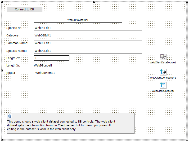
When the dataset is connected to the server, the DB-aware controls display and can edit the data.
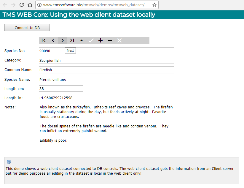
For viewing data, TMS WEB Core comes with following built-in components: TWebClientConnection, TWebClientDataSet, TWebDataSource.
Drop the components on the form and assign the WebClientConnection instance to WebClientDataSet.Connection and assign the WebClientDataSet to WebDataSource.
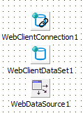
The data will be retrieved via a HTTP GET request in JSON format. To fill the client dataset, it is expected that the JSON consists of a JSON array or a JSON array under a specific node in the JSON HTTP response. Specify the URL where the HTTP GET retrieves the JSON data via WebClientConnection.URI. When the JSON array is under a specific node, specify this with WebClientConnection.DataNode: string;
As JSON as such does not come with meta-data, it will be needed to setup the DB fields expected in the JSON array. Add these as new fields to the dataset via the “Fields Editor” or select “Fetch fields” from the design-time editor of the WebClientDataSet:
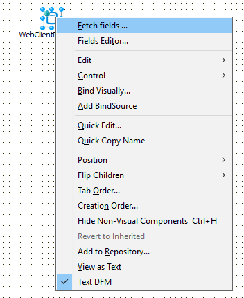
When a WebClientConnection is assigned to the WebClientDataSet and an URL is specified, the IDE will perform a HTTP request and interpret the retrieved JSON and add the DB fields found.
For example, for this sample JSON data at URL: https://jsonplaceholder.typicode.com/posts the result is:
After this, we can simply choose from the dataset fields editor “Add all fields” and all fields available in the JSON data will be available for our DB-aware controls:
After setting WebClientConnection.Active = true, the WebClientConnection performs a HTTP GET request on the URL to fetch the JSON data. This is an asynchronous process. When this is ready, the OnAfterConnect event is triggered. When this event is triggered, all data was loaded into the connected WebClientDataSet and the data is ready for use. When WebClientConnection.AutoOpenDataSet = true, the WebClientConnection will automatically open the dataset after this, making it ready to put data in connected DB-aware controls. A typical flow to connect to data, fetch it and then using the dataset directly from code is:
procedure TForm1.WebButton1Click(Sender: TObject);
begin
  // start the asynchronous process to perform a HTTP GET request to retrieve the data
  WebClientConnection1.Active := true;
end;
procedure TForm1.WebClientConnection1AfterConnect(Sender: TObject);
begin
  // Data was retrieved in OnAfterConnect, dataset was automatically opened by the
  // WebClientConnection and ready for use
  WebClientDataSet1.First;
  while not WebClientDataSet1.Eof do
  begin
    WebListbox1.Items.Add(WebClientDataSet1.FieldByName('email').AsString);
    WebClientDataSet1.Next;
  end;
end;
Connecting to a TMS XData based server is one possible way to hook up to databases. Please refer to the TMS XData documentation for information how you can connect to TMS XData exposed databases from a TMS WEB Core application. You can implement your own interfaces to a database server via REST HTTP calls and over-time we plan to create and offer connectors to such server as Embarcadero RAD server, Google Cloud datastore and several others…
TMS WEB Core promises easy, fast and RAD component based web application development. For fast, real-time updates on a web page with light-weight server-communications, WebSockets are an ideal mechanism. That is why TMS WEB Core also comes with a WebSocket client:
This is a non-visual component that makes it very easy to start using WebSocket based communication. Drop this component on the form, configure the WebSocket hostname & port and call WebSocketClient.Connect. When a connection is established, the OnConnect event is triggered. From the moment of connection, data sent by the WebSocket server is received via the event OnDataReceived. The signature of this event is:
procedure OnDataReceived(Sender: TObject; Origin: string; Data: TJSObject);
Origin is the WebSocket server sending the data and the data itself is sent as a JavaScript Object. This means it can be different types. Sending data is equally easy. Simply call
WebSocketClient1.Send(AMessage: String);
To create an online chat application using this WebSocket technology takes only a few configurations in the component to configure the WebSocket server and a couple of lines of code. There is the logic that performs the Connect & Disconnect:
procedure TWebForm1.Connect;
begin
  if FConnected then
  begin
    WebSocketClient1.Disconnect;
  end
  else
  begin
    if WebEdit1.Text = '' then
      ShowMessage('Please enter a name first')
    else
      WebSocketClient1.Connect;
  end;
end;
To send a message when connected, we simply send the message as color/sender/message pair via the WebSocketClient.Send() function. Each chat user can choose a color and messages from the user are displayed in his selected color:
procedure TWebForm1.SendMessage;
var
  s: string;
begin
  if FConnected and (WebEdit2.Text <> '') then
  begin
    s := TMSFNCColorPicker1.SelectedColor) + '~' + WebEdit1.Text + '~' + WebEdit2.Text;
    // limit message length
    s := Copy(s,1,256);
    WebSocketClient1.Send(TTMSFNCGraphics.ColorToHTML(s);
    WebEdit2.Text := '';
  end;
end;
To display the message, we use the web-enabled TTMSFNCListBox component from the TMS FNC UI Pack. With this control we can show the received messages in listbox items with banding and some HTML formatting per item to indicate the sender and the message. The message is received via WebSocketClient.OnDataReceived as text and therefore we can use Data.toString to get the JavaScript object as text:
procedure TWebForm1.WebSocketClient1DataReceived(Sender: TObject; Origin: string;
  Data: TJSObject);
var
  it: TTMSFNCListBoxItem;
  sl: TStringList;
  s: String;
  n: string;
  c: TTMSFNCGraphicsColor;
  v: string;
begin
  it := lst.Items.Add;
  s := Data.toString;
  sl := TStringList.Create;
  try
    TTMSFNCUtils.Split('~', s, sl);
    if sl.Count > 2 then
    begin
      c := TTMSFNCGraphics.HTMLToColor(sl[0]);
      n := '<font size="14">'+sl[1]+'</font>';
      v := sl[2];
      it.Text := n + ' says:  ' + v;
      it.TextColor := c;
    end;
  finally
    sl.Free;
  end;
end;
There isn’t much more to creating a chat application for your TMS WEB Core applications except of course to put a WebSocket server application on your server that can equally be written with Delphi. See the TMS WEB Core demos for a sample WebSocket server service application.
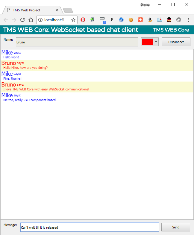
TMS WEB Core chat client application running in the Chrome browser
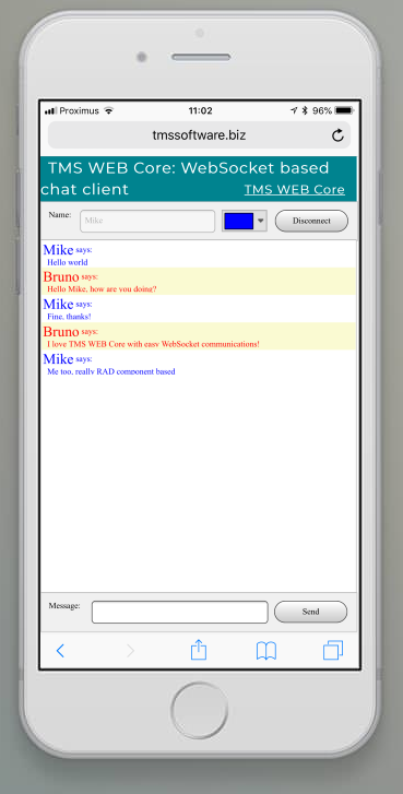
TMS WEB Core chat client application running in the Safari browser on iPhone
Under the TMS RADical Web umbrella, TMS WEB Core is the foundation framework. As one of the goals of TMS RADical Web is to bring RAD to web development for Delphi developers, it is only logical that using components to develop web applications is an essential part. While TMS WEB Core already comes with a wide range of components out of the box, having an extensible component framework is a key feature. In this article, we will have a look at building custom components for TMS WEB Core. TMS WEB Core components can be categorized in roughly 4 types:
Non-visual components
The good news here is that non-visual components for TMS WEB Core are identical to non-visual components for VCL or FMX applications. In TMS WEB Core, the base classes TComponent & TPersistent are available and new non-visual components can be inherited from these base classes and properties, events, methods can be added. The non-visual component can be added to web forms just like VCL non-visual components can be added to VCL forms. Note though that the standard VCL non-visual components included in Delphi can’t be used as-is on web forms. After all, all this code needs to run directly in the browser. But already out of the box, TMS WEB Core offers many equivalents to standard VCL non-visual components like the TWebTimer for example being equivalent for TTimer or a TWebDataSource as equivalent for TDataSource. There is one key requirement to make your custom non-visual component available on the Delphi component palette when a web project is opened and that is to decorate the component with an attribute TMSWebPlatform (defined in WebLib.Controls.pas):
  [ComponentPlatforms(TMSWebPlatform)]
  TMyWebComponent = class(TComponent)
  private
  // your private variables & methods here
  protected
  // your protected methods here
  public
  // your public methods here
  published
  // your published properties and events here
  end;
The architecture for this type of controls is based on writing a Pascal class that wraps the HTML element or element hierarchy. The Pascal wrapper class will do the following:
To create such component, it can inherit from TCustomControl that already includes much of the required logic. Key virtual methods and essential properties defined in TCustomControl are:
  TCustomControl = class(TComponent)
  protected
    function CreateElement: TJSElement; virtual;
    function ContainerElement: TJSElement; virtual;
    procedure BindElement; virtual;
    procedure UpdateElementSize; virtual;
    procedure UpdateElementVisual; virtual;
    procedure UpdateElementData; virtual;
    procedure CreateInitialize; virtual;
  published
    property ElementID;
    property ElementClassName;
  end;
Override the CreateElement function to create the HTML element or HTML element hierarchy needed for the control. This function returns a reference to the parent or container HTML element for the control. If only a single HTML element will be needed in the custom control, this is as simple as:
function TMyCustomControl.CreateElement: TJSElement;
begin
  Result := document.createElement('DIV');
end;
The parent or container element returned by the CreateElement function can be retrieved from other places in the control code via the function ContainerElement. The CreateElement function will be called automatically from the base class when the control ElementID is empty at the time the control parent is set. When ElementID is not empty, the container element is retrieved from the DOM based on ElementID value, i.e. the control class will use the HTML element returned by document.getElementById(ElementID). By default, JavaScript event binding is done on the container element. The base class already binds the JavaScript onwheel, onclick, onmousedown, onmouseup, onmousemove, onmouseleave, onmouseenter, onkeydown, onkeyup, onkeypress, onfocus and onblur events. The base class already maps these JavaScript events on virtual class methods with a signature compatible with VCL, that are easy to override. These are for example the available virtual key and mouse event related methods:
  TCustomControl = class(TComponent)
  protected
    procedure MouseUp(Button: TMouseButton; Shift: TShiftState; X,Y: Integer); virtual;
    procedure MouseDown(Button: TMouseButton; Shift: TShiftState; X,Y: Integer); virtual;
    procedure MouseMove(Shift: TShiftState; X,Y: Integer); virtual;
    procedure DoMouseEnter; virtual;
    procedure DoMouseLeave; virtual;
    procedure MouseWheel(Shift: TShiftState; WheelDelta: Integer; var Handled: Boolean); virtual;
    procedure DblClick; virtual;
    procedure KeyDown(var Key: Word; Shift: TShiftState); virtual;
    procedure KeyPress(var Key: Char); virtual;
    procedure KeyUp(var Key: Word; Shift: TShiftState); virtual;
  end;
So, from our custom control, all we need to do is override these virtual methods, so it is very similar to writing VCL custom controls.
Three more important virtual methods that will typically be overridden are:
The UpdateElementSize procedure is supposed to do the necessary HTML element attribute changes when the position and/or size of the control changes. The base class TCustomControl will already handle this for the container element Top,Left,Width & Height. (when the control is absolute positioned that is).
The UpdateElementVisual method is the place where typically Pascal class properties that affect the visual appearance of controls, are mapped onto HTML element(s) attributes. The UpdateElementData method is the place where properties that affect data connected to controls is updated in the HTML element. To illustrate this, let’s assume our custom control mapping on a HTML DIV element has a color property to set background color of the DIV and a text property for the text in the HTML DIV element. The corresponding code for this is:
uses
  Classes, WEBLib.Controls, Web;
TMyCustomControl = class(TCustomControl)
private
  FColor: TColor;
  FText: string;
  procedure SetColor(const AValue: TColor);
  procedure SetText(const AValue: string);
protected
  function CreateElement: TJSElement; override;
  procedure UpdateElementVisual; override;
  procedure UpdateElementData; override;
published
  property Color: TColor read FColor write SetColor;
  property Text: string read FText write SetText;
end;
function TMyCustomControl.CreateElement: TJSElement;
begin
  Result := document.createElement('DIV');
end;
procedure TMyCustomControl.SetColor(const AValue: TColor);
begin
  if (AValue <> FColor) then
  begin
    FColor := AValue;
    UpdateElementVisual;
  end;
end;
procedure TMyCustomControl.SetText(const AValue: string);
begin
  if (AValue <> FText) then
  begin
    FText := AValue;
    UpdateElementData;
  end;
end;
procedure TMyCustomControl.UpdateElementVisual;
var
  el: TJSHTMLElement;
begin
  inherited;
  el := TJSHTMLElement(ContainerElement);
  el.style.setProperty('background-color', ColorToHTML(Color));
end;
procedure TMyCustomControl.UpdateElementData;
var
  el: TJSHTMLElement;
begin
  inherited;
  el := TJSHTMLElement(ContainerElement);
  el.innerHTML := Text;
end;
Finally, to finish this first basic custom control example, let’s add a click handler. As the base class already binds the container element ‘onclick’, this is as simple as:
TMyCustomControl = class(TCustomControl)
published
  property OnClick;
end;
For the sake of completeness, let’s discuss also how to map control methods on HTML element JavaScript events. This is done with the HTML element addEventListener() method.
Example:
TMyCustomControl = class(TCustomControl)
protected
  function HandleDoXXXX(Event: TEventListenerEvent): Boolean; virtual;
  procedure BindEvents; override;
end;

procedure TMyCustomControl.BindEvents;
begin
  inherited;
  Container.addEventListener('xxxx',@HandleDoXXXX);
end;

function TMyCustomControl.HandleDoXXXX(Event: TEventListenerEvent): Boolean;
begin
  // code to be executed when Javascript event XXXX is executed
  Result := true;
end;
Assume the HTML event has a JavaScript event named XXXX, the control class method HandleDoXXXX will be called when this JavaScript event is triggered.
Visual controls using the FNC abstraction layer
A second approach to create custom controls for TMS WEB Core is by inheriting from the base class TTMSFNCCustomControl defined in the TMS FNC Core. The good news is that by doing so, the control code will work for VCL applications, FMX applications, LCL applications and of course also web applications. Technically, for a web application, an FNC web control will internally create a HTML CANVAS element. It maps all needed JavaScript events on this CANVAS to the control virtual methods and it offers an FNC TTMSFNCGraphics Pascal wrapper class to perform the painting of these controls. To get started, the FNC units we will use are:
WEBLib.TMSFNCCustomControl : defines the base class TTMSFNCCustomControl WEBLib.TMSFNCGraphics : defines the class TTMSFNCGraphics for painting WEBLib.TMSFNCTypes : defines various types used with custom controls
WEBLib.TMSFNCGraphicsTypes : defines various types for handling painting
The class interface can be defined as:
  TMyFNCCustomControl = class(TTMSFNCCustomControl)
  private
    FColor: TColor;
    FText: string;
    FDown: boolean;
    procedure SetColor(const AValue: TColor);
    procedure SetText(const AValue: string);
  protected
    procedure HandleMouseDown(Button: TTMSFNCMouseButton; Shift: TShiftState; X, Y: Single); override;
    procedure HandleMouseUp(Button: TTMSFNCMouseButton; Shift: TShiftState; X, Y: Single); override;
    procedure HandleKeyPress(var Key: Char; Shift: TShiftState); override;
    procedure Draw(AGraphics: TTMSFNCGraphics; ARect: TRectF); override;
  published
    property Color: TColor read FColor write SetColor;
    property Text: string read FText write SetText;
  end;
The implementation for the property setters is:
procedure TMyFNCCustomControl.SetColor(const AValue: TColor);
begin
  if (AValue <> FColor) then
  begin
    FColor := AValue;
    Invalidate;
  end;
end;
procedure TMyFNCCustomControl.SetText(const AValue: string);
begin
  if (AValue <> FText) then
  begin
    FText := AValue;
    Invalidate;
  end;
end;
To have the control draw itself, all we need to do is override the FNC control Draw() virtual method.
procedure TMyFNCCustomControl.Draw(AGraphics: TTMSFNCGraphics; ARect: TRectF);
begin
  inherited;
  if FDown then
    AGraphics.Fill.Color := gcGray
  else
    AGraphics.Fill.Color := Color;
  AGraphics.DrawRectangle(ARect);
  AGraphics.DrawText(10,10,FText);
end;
Let’s implement for this basic sample a key event handler that will add the character pressed to the control text and the mouse down that will show the control in a different color.
procedure TMyFNCCustomControl.HandleKeyPress(var Key: Char; Shift: TShiftState);
begin
  Text := Text + Key;
end;
procedure TMyFNCCustomControl.HandleMouseDown(Button: TTMSFNCMouseButton; Shift: TShiftState; X, Y: Single);
begin
  FDown := true;
  Invalidate;
end;
procedure TMyFNCCustomControl.HandleMouseUp(Button: TTMSFNCMouseButton; Shift: TShiftState; X, Y: Single);
begin
  FDown := false;
  Invalidate;
end;
Creating a Pascal wrapping class for a jQuery UI control has in fact several similarities with creating a wrapping class for HTML elements as jQuery UI controls are exactly that, a hierarchy of HTML elements. What is a bit different is that typically the jQuery control is created by calling a JavaScript function that creates it. The jQuery object then typically exposes its own events and our control needs to bind to these events. To facilitate this, the TMS WEB Core framework offers a base class TjQueryCustomControl. This class adds the virtual method InitjQuery() that is called when the jQuery control needs to be created and the function GetJQID function that returns the unique jQuery ID for our control. The jQuery control will by default be hosted in a HTML DIV element. What we learned from wrapping HTML elements, is that the virtual methods UpdateElementVisual() / UpdateElementData() are what is called when property changes need to be reflected in the control jQuery settings or data. To create a Pascal wrapper class for a jQuery control, the minimal approach is as such:
  TmyJQueryControl = class(TjQueryCustomControl)
  protected
    procedure InitJQuery; override;
  end;
procedure TmyJQueryControl.InitJQuery;
begin
  // create the jQuery control here
end;
To show the basic concepts, we demonstrate this with a minimal wrapper for the a nice jQuery progress bar offered here: https://kimmobrunfeldt.github.io/progressbar.js/
Following the docs of this library, to create the jQuery progressbar, we need the following JavaScript code for a half circle progressbar:
var bar = new ProgressBar.SemiCircle(div, {options});
To update the position of the progressbar, we can use bar.animate(position); // with position a value between 0 and 1.
So, our full control code becomes:
  TjQueryProgressBar = class(TjQueryCustomControl)
  private
    FPosition: double;
    FBar: TJSElement;
    procedure SetPosition(const Value: double);
  protected
    procedure InitJQuery; override;
    procedure UpdateElementVisual; override;
  published
    property Position: double read FPosition write SetPosition;
  end;
{ TjQueryProgressBar }
procedure TjQueryProgressBar.InitJQuery;
var
  eh: TJSElement;
begin
  eh := ElementHandle;
  asm
    this.FBar = new ProgressBar.SemiCircle(eh, {
    strokeWidth: 6,
    easing: 'easeInOut',
    duration: 1400,
    color: '#FFEA82',
    trailColor: '#eee',
    trailWidth: 1,
    svgStyle: null
    });
  end;
end;
 procedure TjQueryProgressBar.SetPosition (const Value: double);
 begin
   if (FPosition <> Value) then
 begin
     FPosition := Value;
     UpdateElementVisual;
   end;
 end;
 procedure TjQueryProgressBar.UpdateElementVisual;
 begin
   inherited;
   if IsUpdating then
     Exit;
   if not Assigned(FBar) then
     Exit;
   asm
     this.FBar.animate(this.FPosition);
   end;
end;
Note here the asm/end blocks in the code. As for reasons of simplicity, we have not taken the effort to create a Pascal wrapper class for the ProgressBar jQuery object, we need to directly access this jQuery object with JavaScript. It is in the asm/end block in our Pascal code that we can directly write this JavaScript code. This code does not get compiled but is just directly generated inline as-is. As you can see, we map a private variable FBar to the created jQuery object created in the InitJQuery call and from the UpdateElementVisual override, this FBar object is accessed to call its animate() function to update the value. Also noteworthy is that from the asm/end block, we access the instance asthis".
After creating an instance of this control, we can simply add the following code to the button click handler:
WebjQueryProgressBar1.Position := 0.5;
And the result becomes:
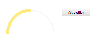
| Code | Language | Code | Language | Code | Language | Code | Language | Code | Language |
|---|---|---|---|---|---|---|---|---|---|
| af | Afrikaans | hr | Croatian | el | Greek | pl | Polish | sx | Sutu |
| sq | Albanian | cs | Czech | gu | Gujurati | pt | Portuguese | sw | Swahili |
| ar | Arabic (Standard) | da | Danish | ht | Haitian | pt-br | Portuguese (Brazil) | sv | Swedish |
| ar-dz | Arabic (Algeria) | nl | Dutch (Standard) | he | Hebrew | pa | Punjabi | sv-fi | Swedish (Finland) |
| ar-bh | Arabic (Bahrain) | nl-be | Dutch (Belgian) | hi | Hindi | pa-in | Punjabi (India) | sv-sv | Swedish (Sweden) |
| ar-eg | Arabic (Egypt) | en | English | hu | Hungarian | pa-pk | Punjabi (Pakistan) | ta | Tamil |
| ar-iq | Arabic (Iraq) | en-au | English (Australia) | is | Icelandic | qu | Quechua | tt | Tatar |
| ar-jo | Arabic (Jord) | en-bz | English (Belize) | id | Indonesian | rm | Rhaeto-Romanic | te | Teluga |
| ar-kw | Arabic (Kuwait | en-ca | English (Canada) | iu | Inuktitut | ro | Romanian | th | Thai |
| ar-lb | Arabic (Lebanon) | en-ie | English (Ireland) | ga | Irish | ro-mo | Romanian (Moldavia) | tig | Tigre |
| ar-ly | Arabic (Libya) | en-jm | English (Jamaica) | it | Italian (Standard) | ru | Russian | ts | Tsonga |
| ar-ma | Arabic (Morocco) | en-nz | English (New Zealand) | it-ch | Italian (Switzerland) | ru-mo | Russian (Moldavia) | tn | Tswana |
| ar-om | Arabic (Oman) | en-ph | English (Philippines) | ja | Japanese | sz | Sami (Lappish) | tr | Turkish |
| ar-qa | Arabic (Qatar) | en-za | English (South Africa) | kn | Kannada | sg | Sango | tk | Turkmen |
| ar-sa | Arabic (Saudi Arabia) | en-tt | English (Trinidad & Tobago) | ks | Kashmiri | sa | Sanskrit | uk | Ukrainian |
| ar-sy | Arabic (Saudi Arabia) | en-gb | English (United Kingdom) | kk | Kazakh | sc | Sardinian | hsb | Upper Sorbian |
| ar-tn | Arabic (Tunisia) | en-us | English (United States) | km | Khmer | gd | Scots Gaelic | ur | Urdu |
| ar-ae | Arabic (U.A.E.) | en-zw | English (Zimbabwe) | ky | Kirghiz | sd | Sindhi | ve | Venda |
| Code | Language | Code | Language | Code | Language | Code | Language |
|---|---|---|---|---|---|---|---|
| ar-ye | Arabic (Yemen) | eo | Esperanto | tlh | Klingon | si | Singhalese |
| ar | Aragonese | et | Estonian | ko | Korean | sr | Serbian |
| hy | Armenian | fo | Faeroese | ko-kp | Korean (North Korea) | sk | Slovak |
| as | Assamese | fa | Farsi | ko-kp | Korean (South Korea) | sl | Slovenian |
| ast | Asturian | fj | Fijian | la | Latin | so | Somani |
| az | Azerbaijani | fi | Finnish | lv | Latvian | sb | Sorbian |
| eu | Basque | fr | French (Standard) | lt | Lithuanian | es | Spanish |
| bg | Bulgarian | fr-be | French (Belgium) | lb | Luxembourgish | es-ar | Spanish (Argentina) |
| be | Belarusian | fr-ca | French (Canada) | mk | FYRO Macedonian | es-bo | Spanish (Bolivia) |
| bn | Bengali | fr-fr | French (France) | ms | Malay | es-cl | Spanish (Chile) |
| bs | Bosnian | fr-lu | French (Luxembourg) | ml | Malayalam | es-co | Spanish (Colombia) |
| br | Breton | fr-mc | French (Monaco) | mt | Maltese | es-cr | Spanish (Costa Rica) |
| bg | Bulgarian | fr-ch | French (Switzerland) | mi | Maori | es-do | Spanish (Dominican Republic) |
| my | Burmese | fy | Frisian | mr | Marathi | es-ec | Spanish (Ecuador) |
| ca | Catalan | fur | Friulian | mo | Moldavian | es-sv | Spanish (El Salvador) |
| ch | Chamorro | gd | Gaelic (Scots) | nv | Navajo | es-gt | Spanish (Guatemala) |
| ce | Chechen | gd-ie | Gaelic (Irish) | ng | Ndonga | es-hn | Spanish (Honduras) |
| zh | Chinese | gl | Galacian | ne | Nepali | es-mx | Spanish (Mexico) |
| zh-hk | Chinese (Hong Kong) | ka | Georgian | no | Norwegian | es-ni | Spanish (Nicaragua) |
| zh-cn | Chinese (PRC) | de | German (Standard) | nb | Norwegian (Bokmal) | es-pa | Spanish (Panama) |
| zh-sg | Chinese (Singapore) | de-at | German (Austria) | nn | Norwegian (Nynorsk) | es-py | Spanish (Paraguay) |
| zh-tw | Chinese (Taiwan) | de-de | German (Germany) | oc | Occitan | es-pe | Spanish (Peru) |
| Code | Language |
|---|---|
| vi | Vietnamese |
| vo | Volapuk |
| wa | Walloon |
| cy | Welsh |
| xh | Xhosa |
| ji | Yiddish |
| zu | Zulu |
| Code | Language | Code | Language | Code | Language | Code | Language |
|---|---|---|---|---|---|---|---|
| cv | Chuvash | de-li | German (Liechtenstein) | or | Oriya | es-pr | Spanish (Puerto Rico) |
| co | Corsican | de-lu | German (Luxembourg) | om | Oromo | es-es | Spanish (Spain) |
| cr | Cree | de-ch | German (Switzerland) | fa | Persian | es-uy | Spanish (Uruguay) |
| fa-ir | Persian/Iran | es-ve | Spanish (Venezuela) |